Challenge
Modernising Witsend’s identity while preserving its heritage
Founded in 2016, Witsend has grown into an influential community of women in technology and leadership. Working closely with the founding team, our challenge was to evolve its identity while preserving its heritage, including the Suffragette-inspired colours and the values that have shaped the community from the beginning. We needed to create a more expressive, flexible brand system to support its continued growth, alongside a refreshed website built on its existing infrastructure.




Solution
Turning the language of code into a brand built around connection
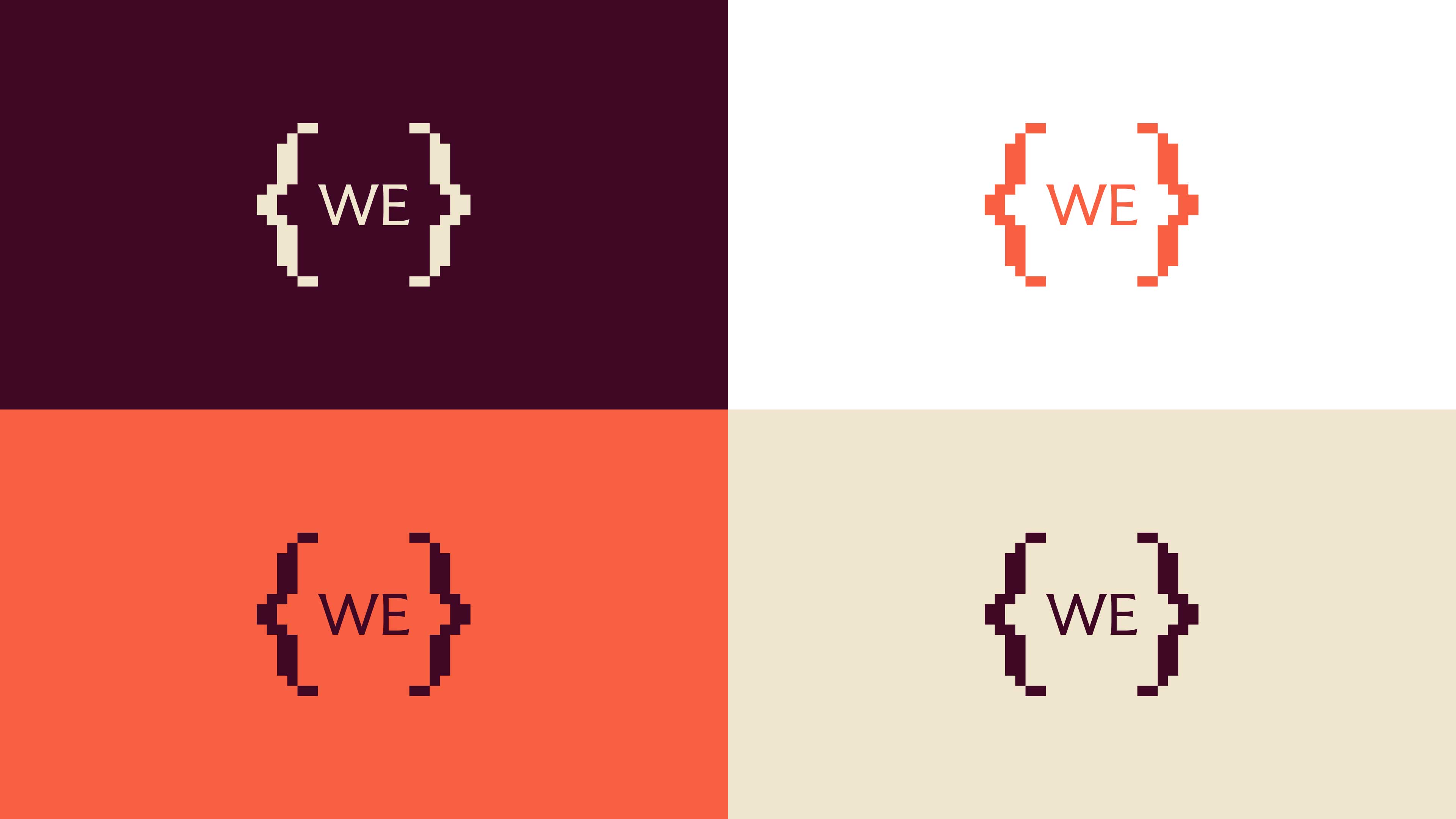
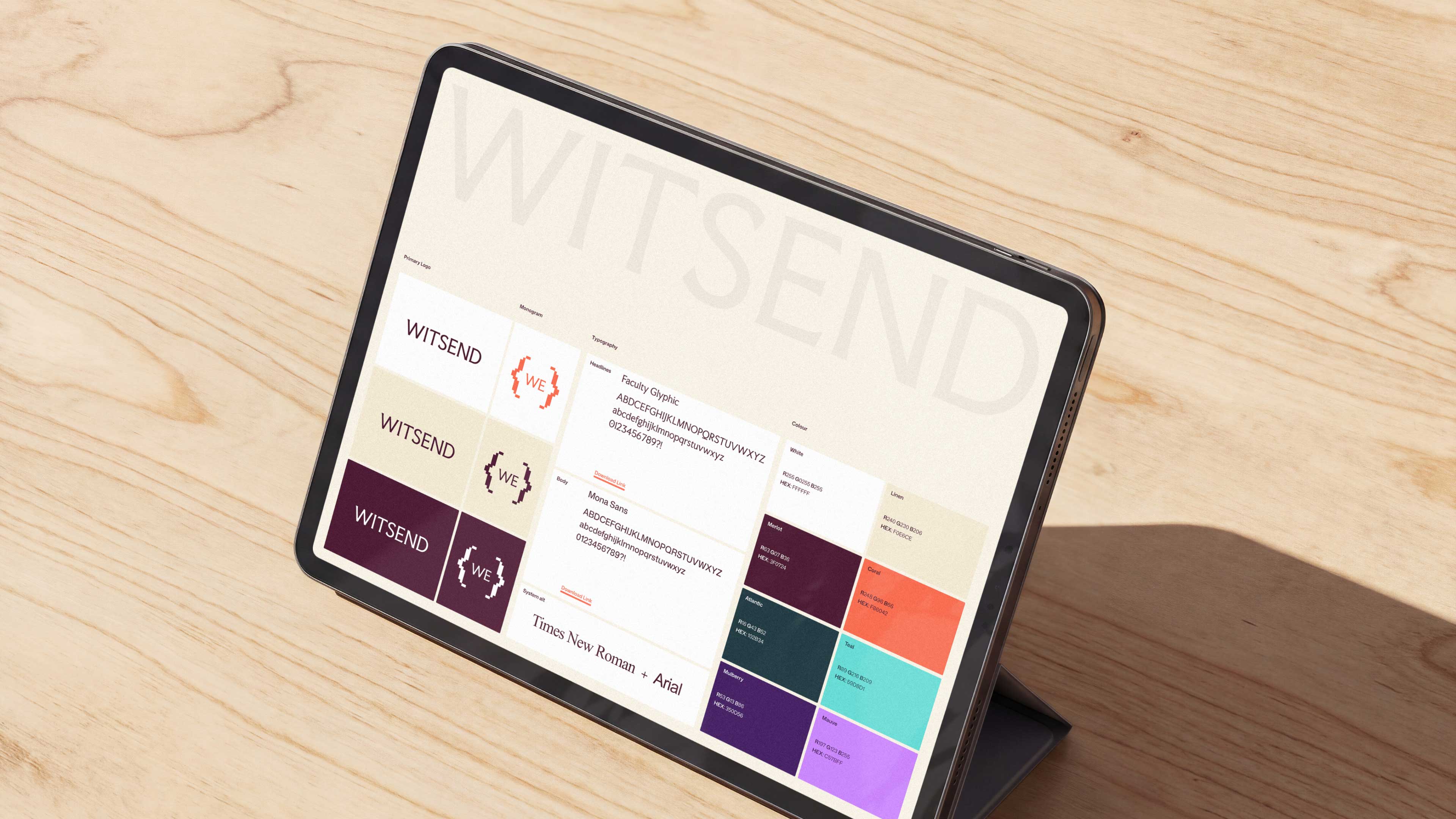
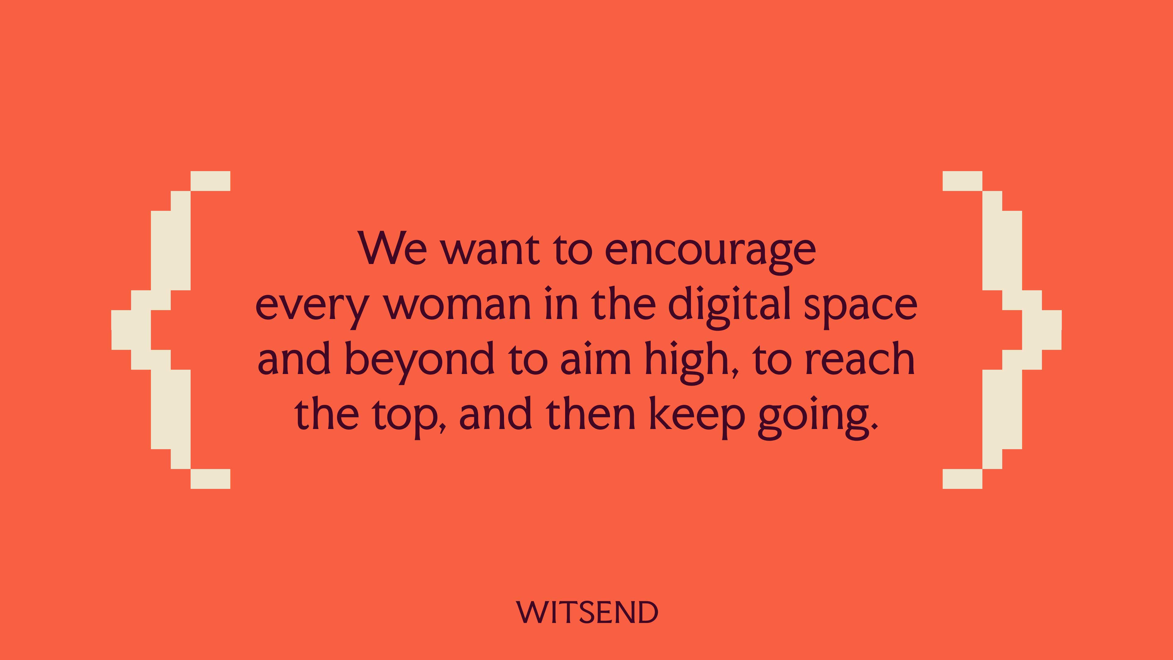
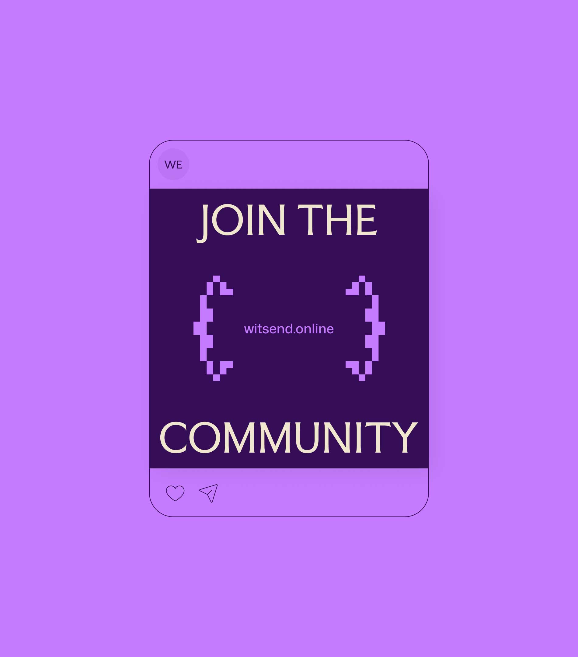
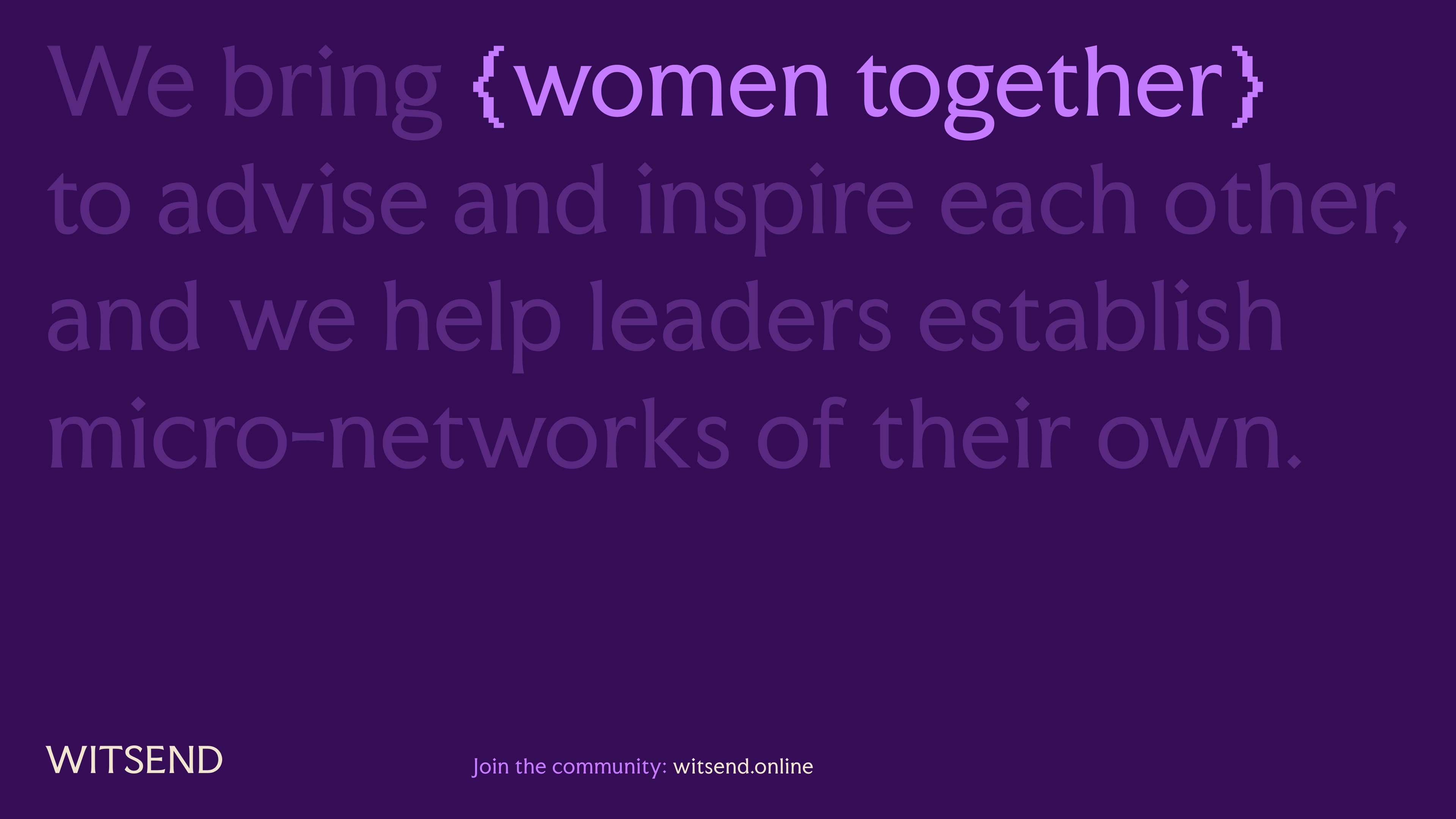
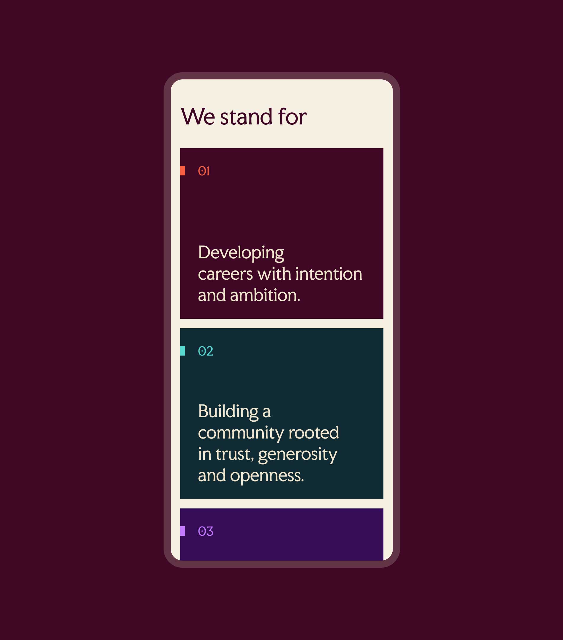
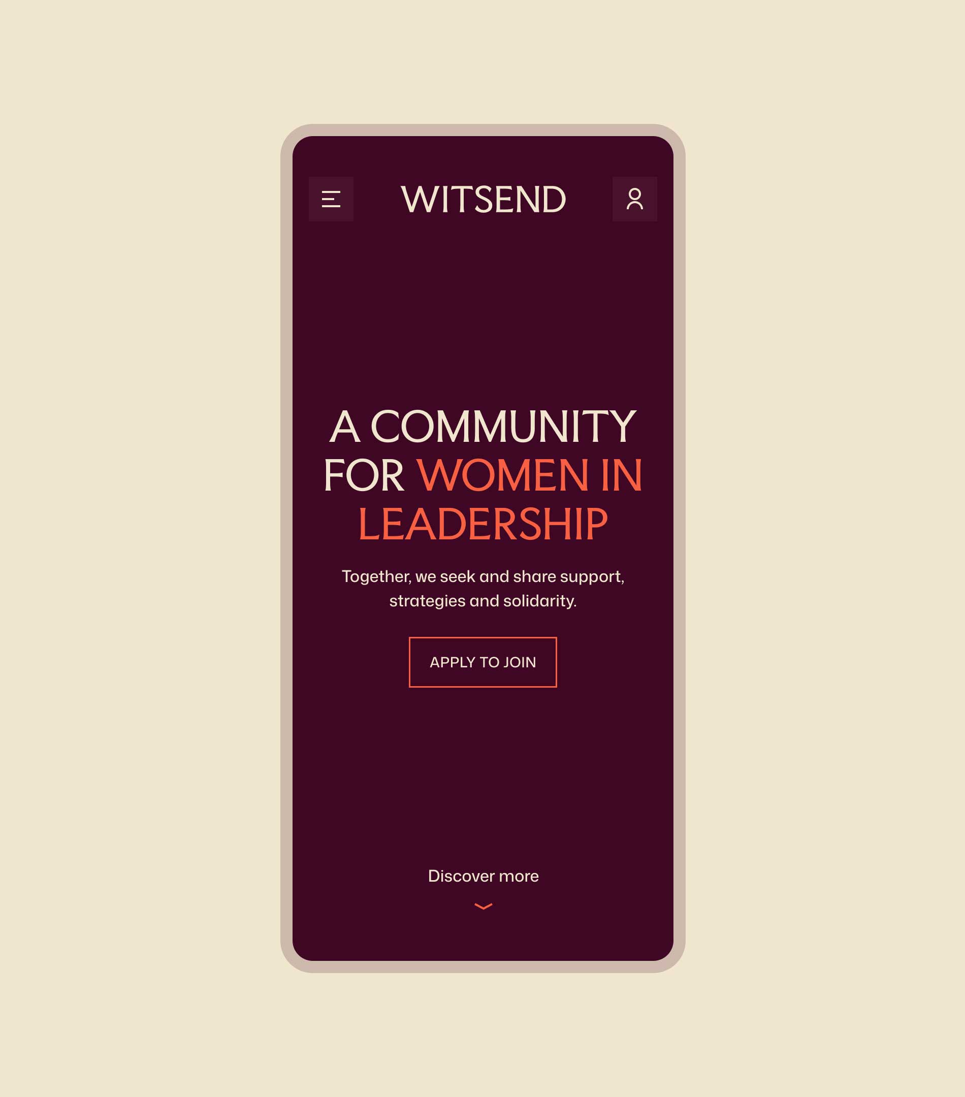
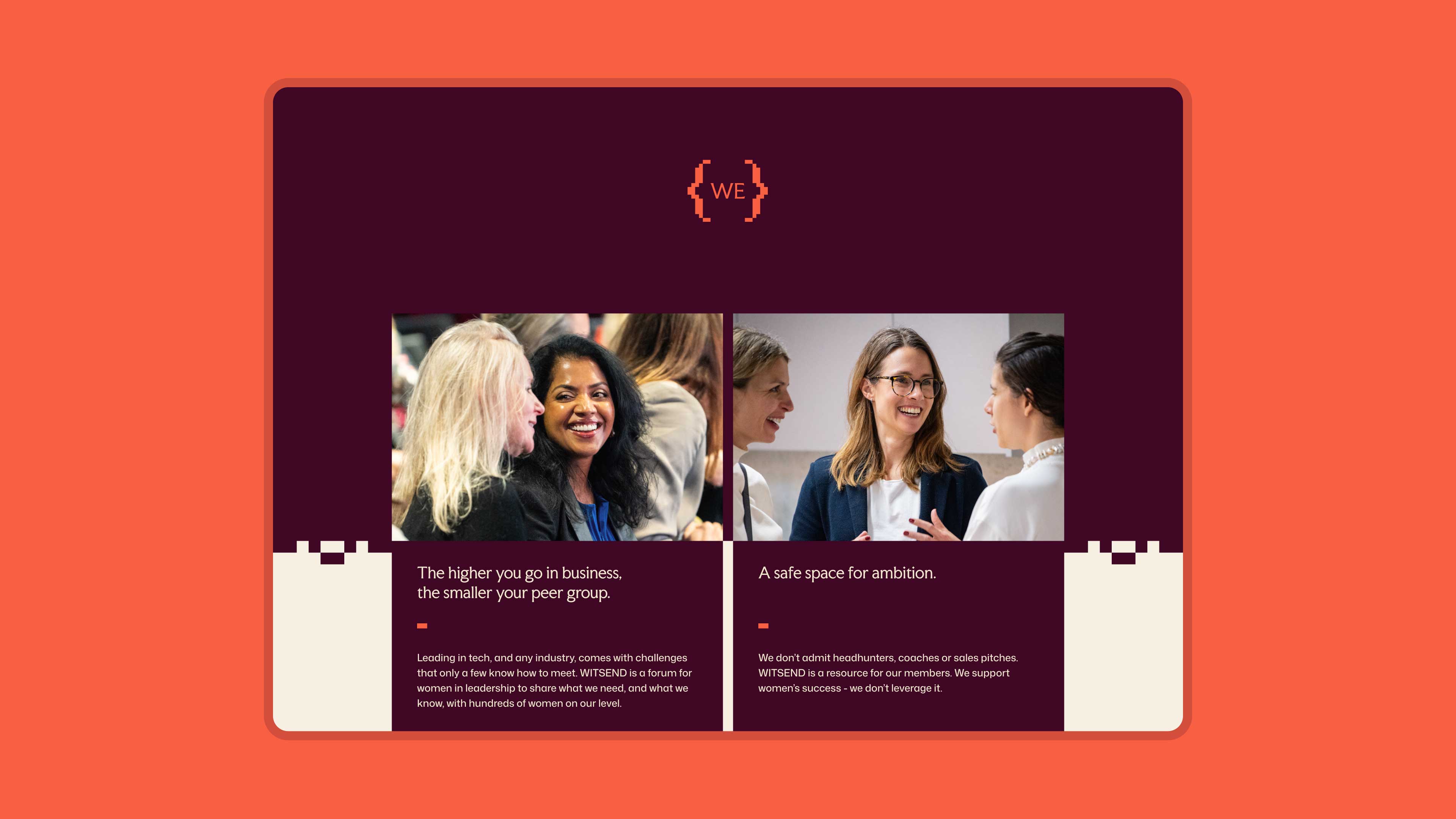
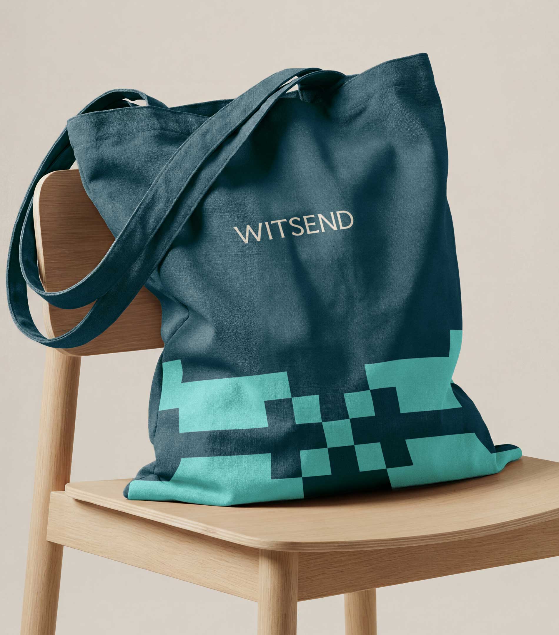
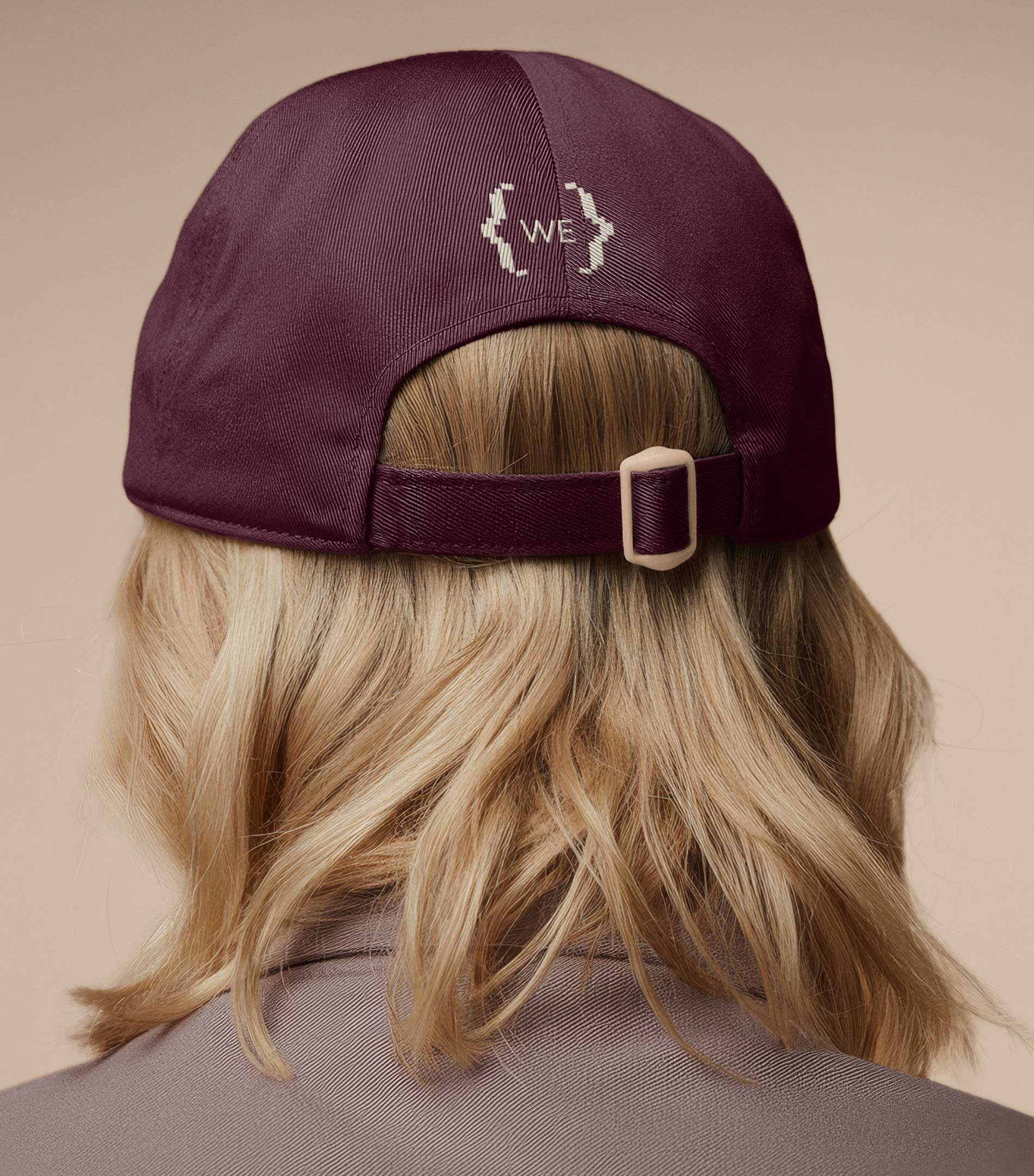
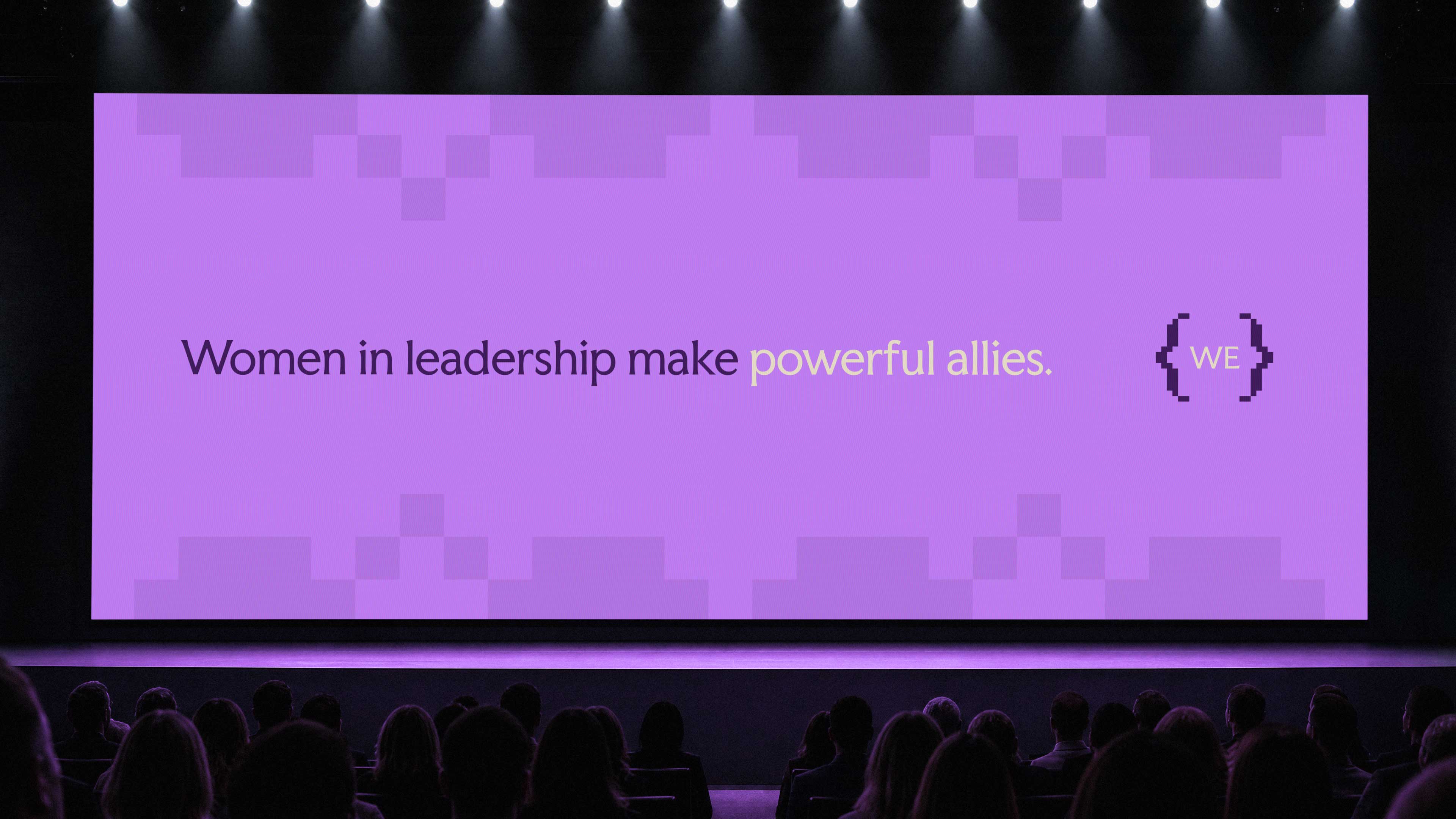
Through collaborative workshops, we explored different visual directions inspired by Witsend’s DNA, ultimately developing an identity that blends traditional chisel-cut typography with modern, code-inspired brackets. The brackets became a visual expression of the space Witsend creates for connection, shared knowledge and support. Building on its Suffragette heritage, we expanded the colour palette and created a flexible visual system that carries through the brand toolkit and refreshed website.






Impact
Evolving a brand for a growing community of women in leadership
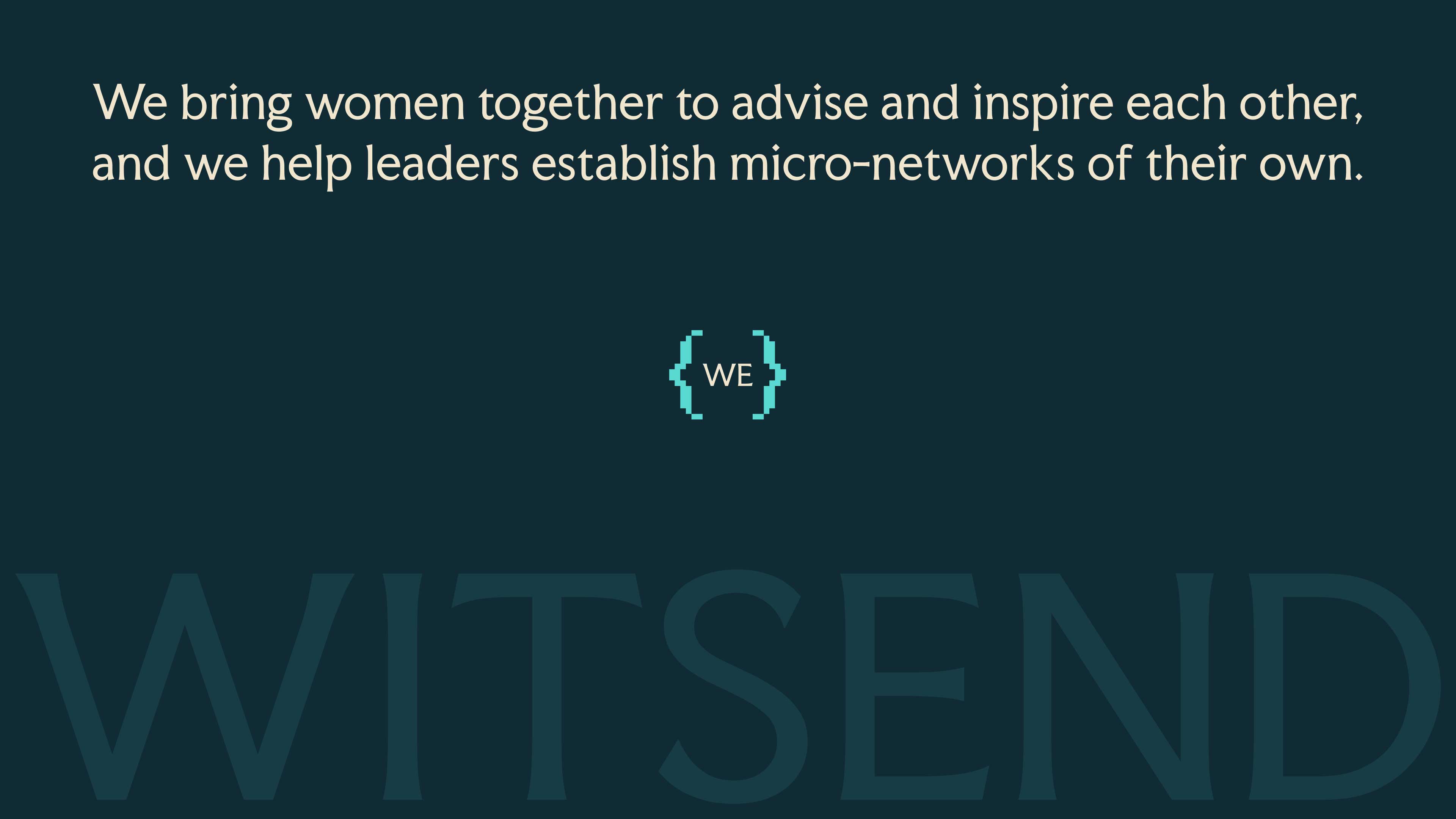
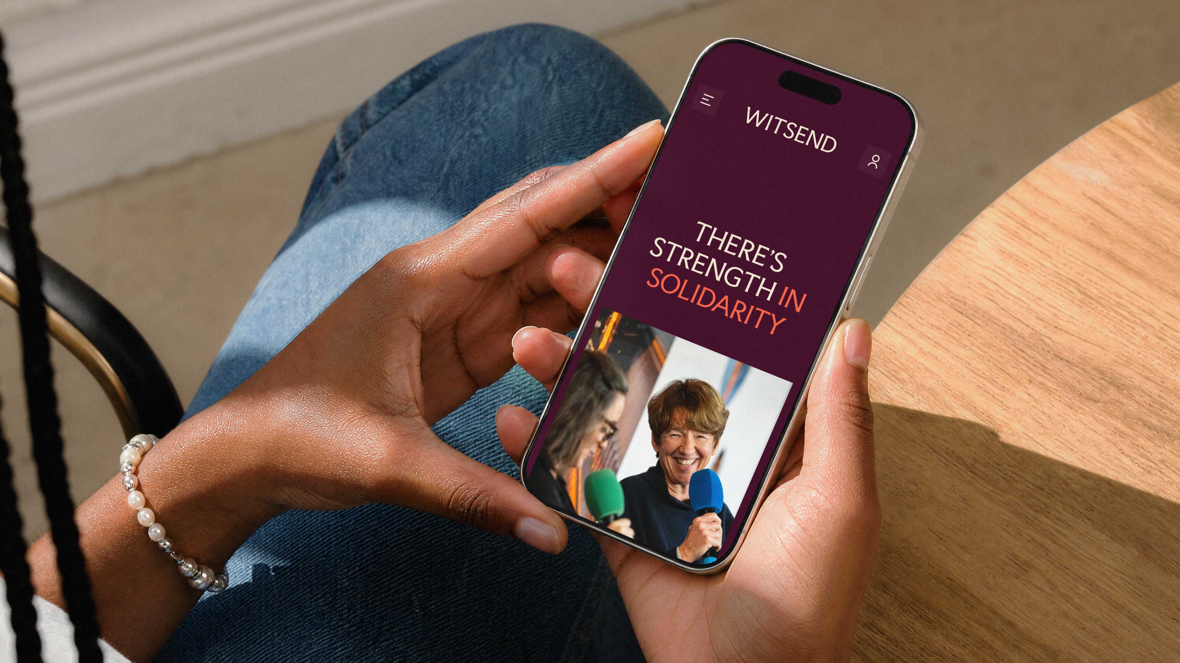
This was a particularly meaningful project for us, working with a community whose purpose and values we wholeheartedly support. We’re proud to have played a part in shaping Witsend’s next chapter, creating a brand that reflects the strength and character of its members while giving the community room to grow. Seeing such a positive response to the new identity has made the work all the more rewarding.
Up Next