Challenge
Creating an innovative brand inside Makevale
Following our work with Makevale, we were asked to help create a new identity for Valomer, a specialist innovation programme developed within the wider business.
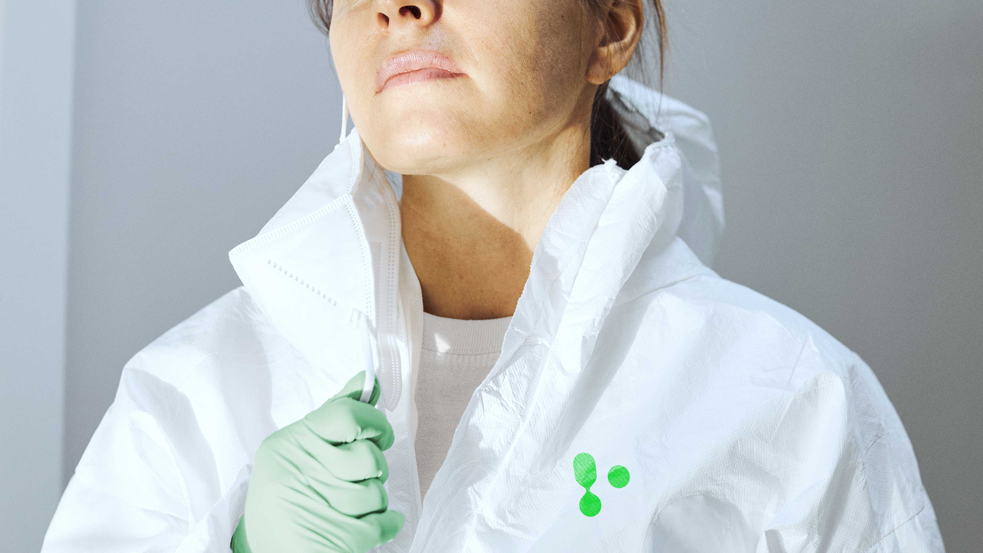
The challenge was to strike a careful balance. Valomer needed enough independence to build credibility around its own proposition and future ambitions, while remaining clearly connected to the Makevale masterbrand. It needed to feel like part of the same family, not a completely separate business. Alongside this, the brand had to communicate innovation and scientific rigour without overwhelming audiences with technical complexity. The goal was to create something accessible, memorable and scalable, capable of supporting future growth and expansion.


Solution
Turning molecular innovation into a visual identity
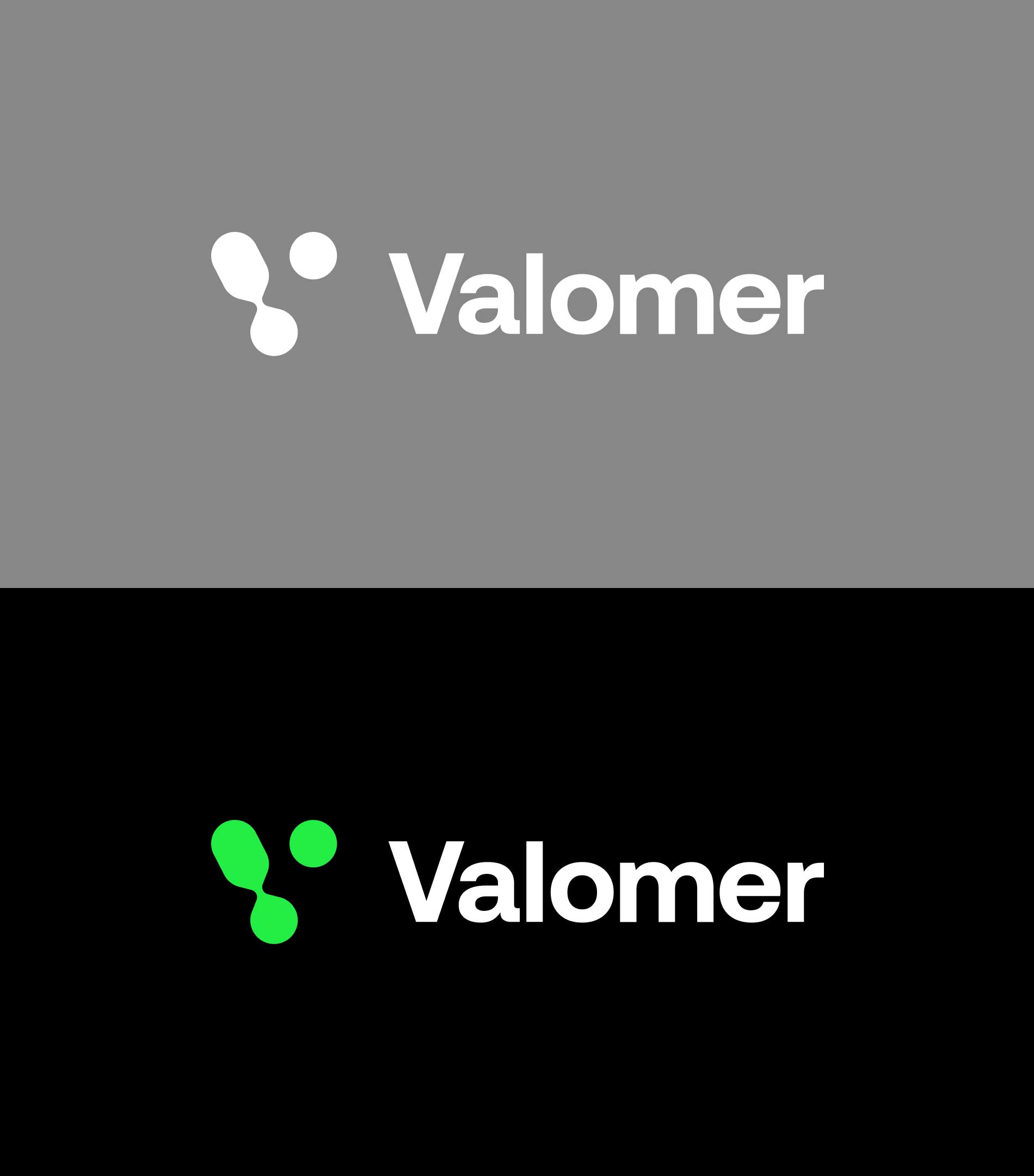
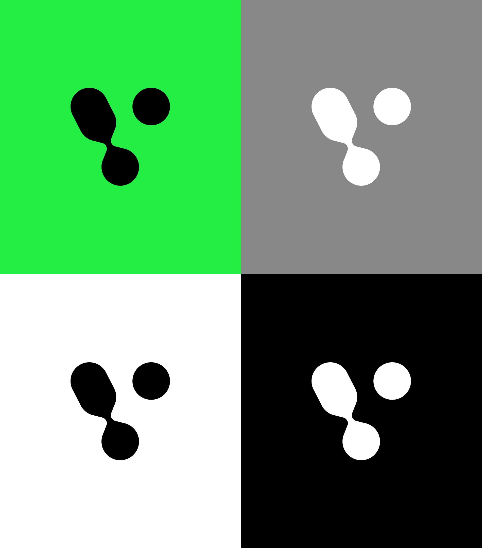
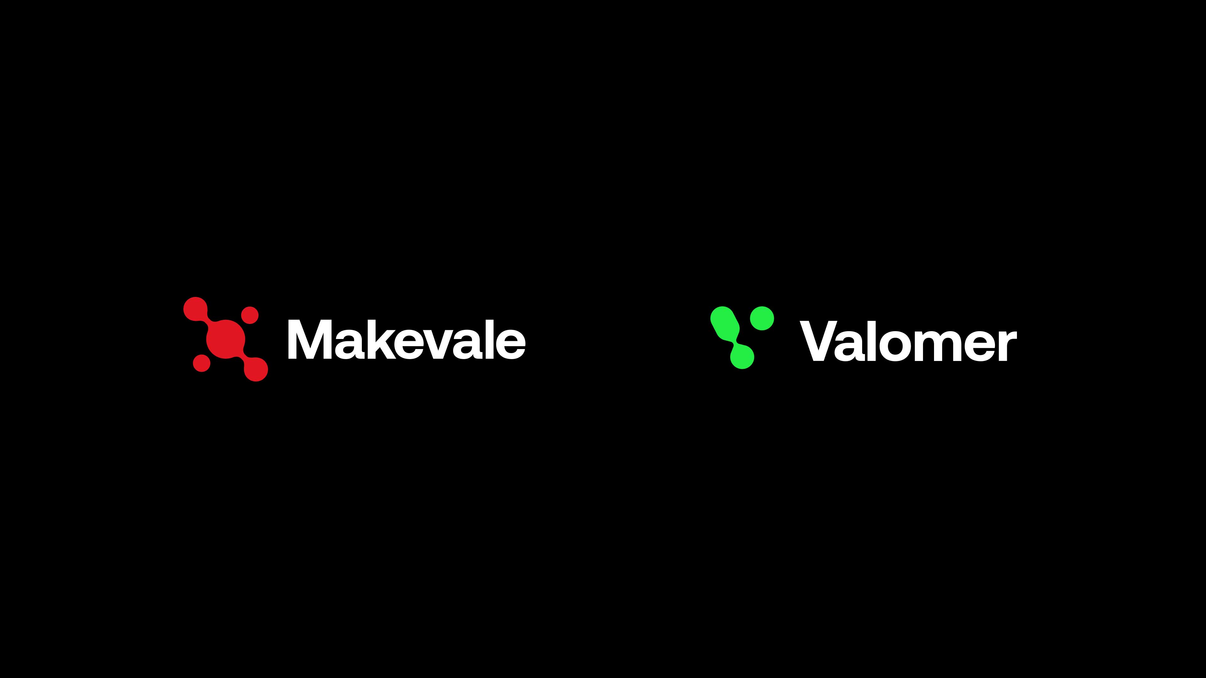
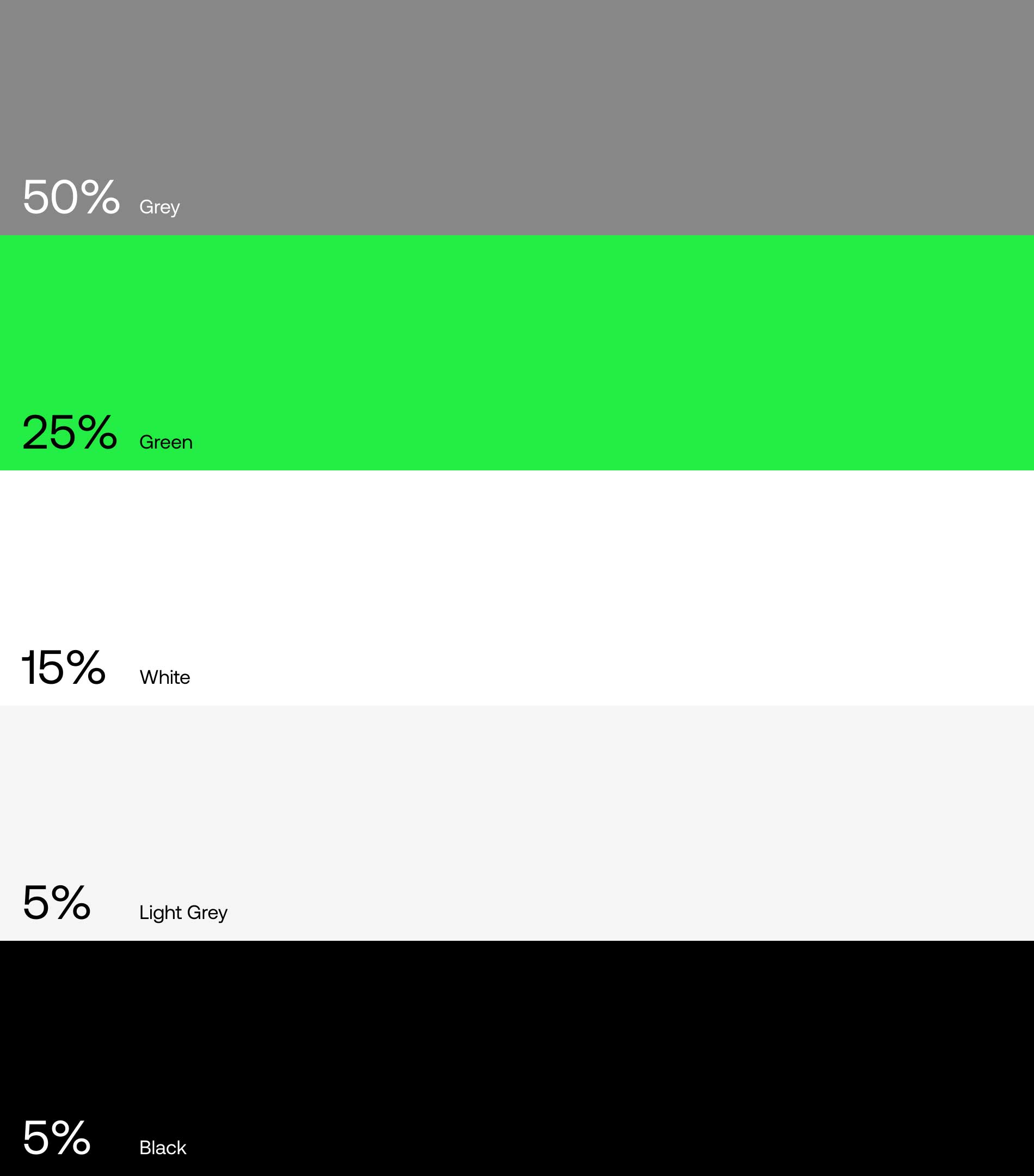
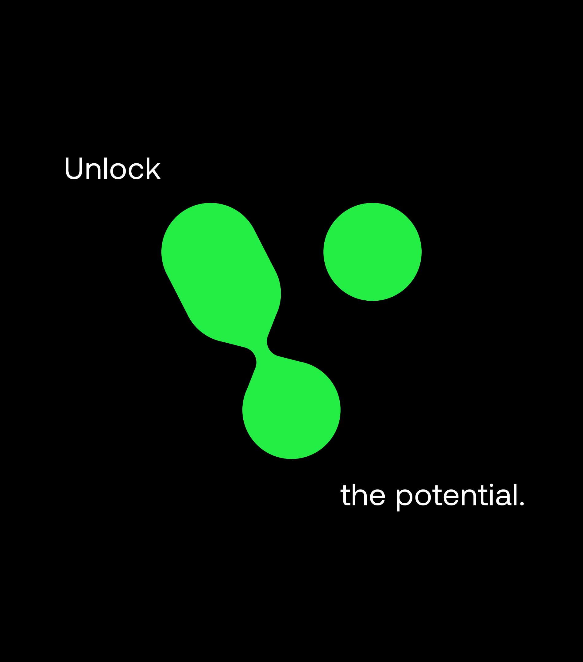
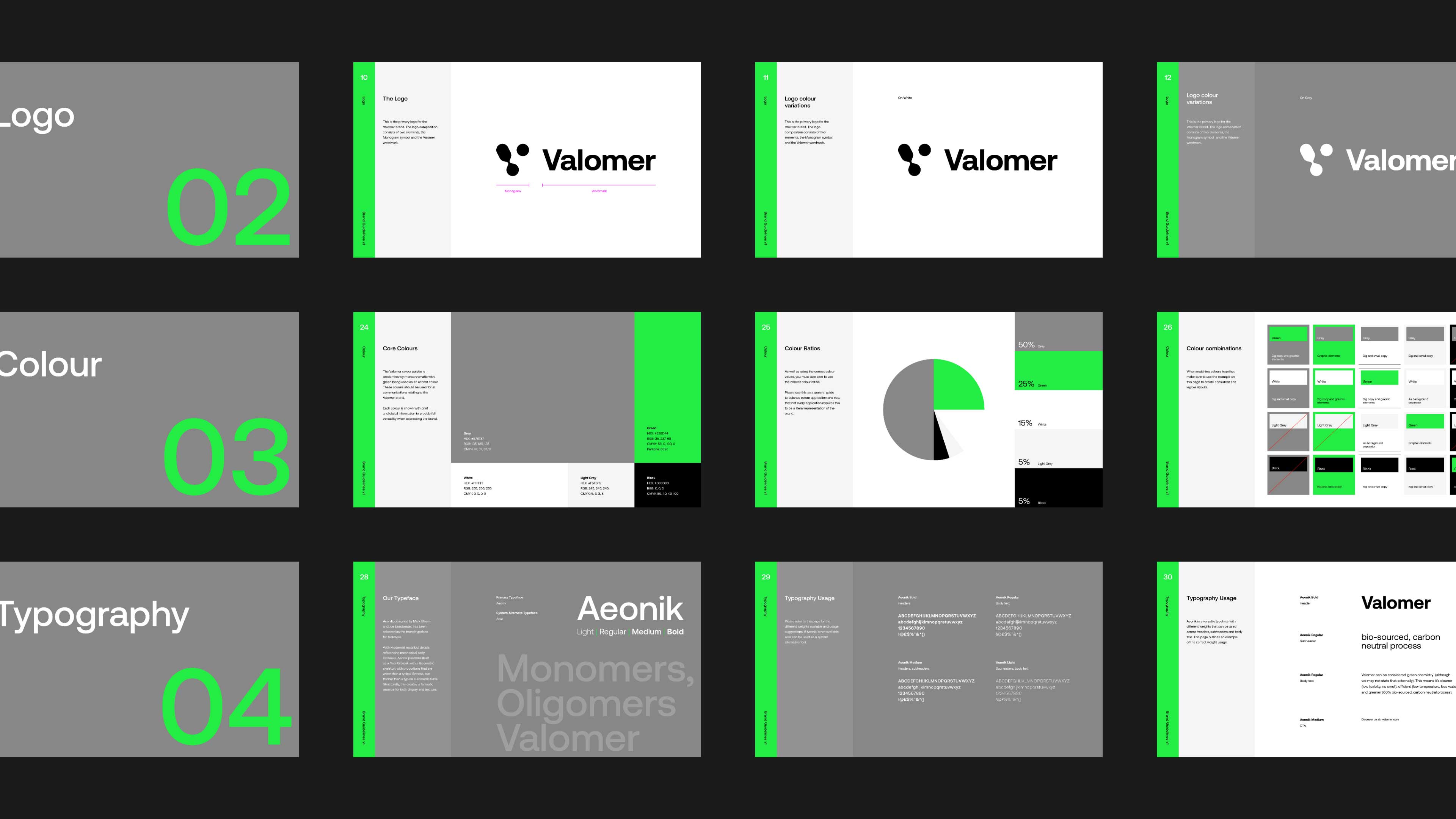
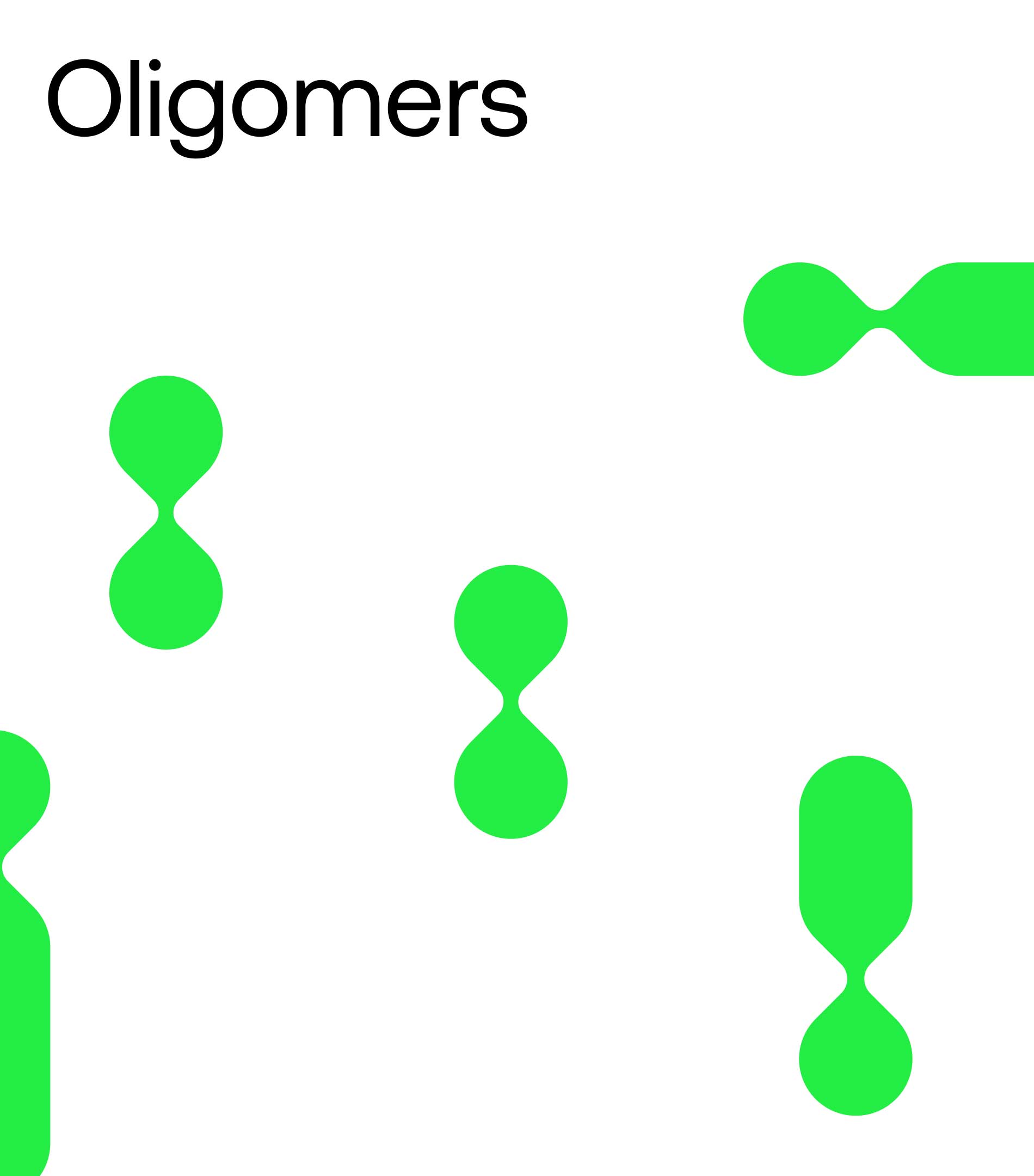
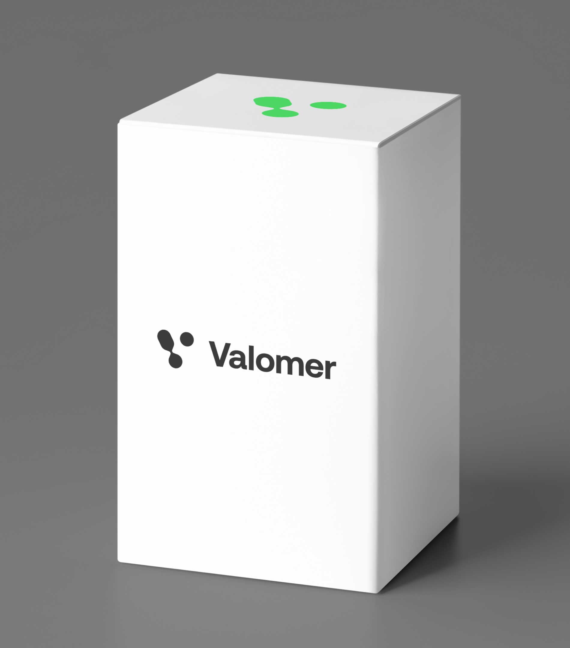
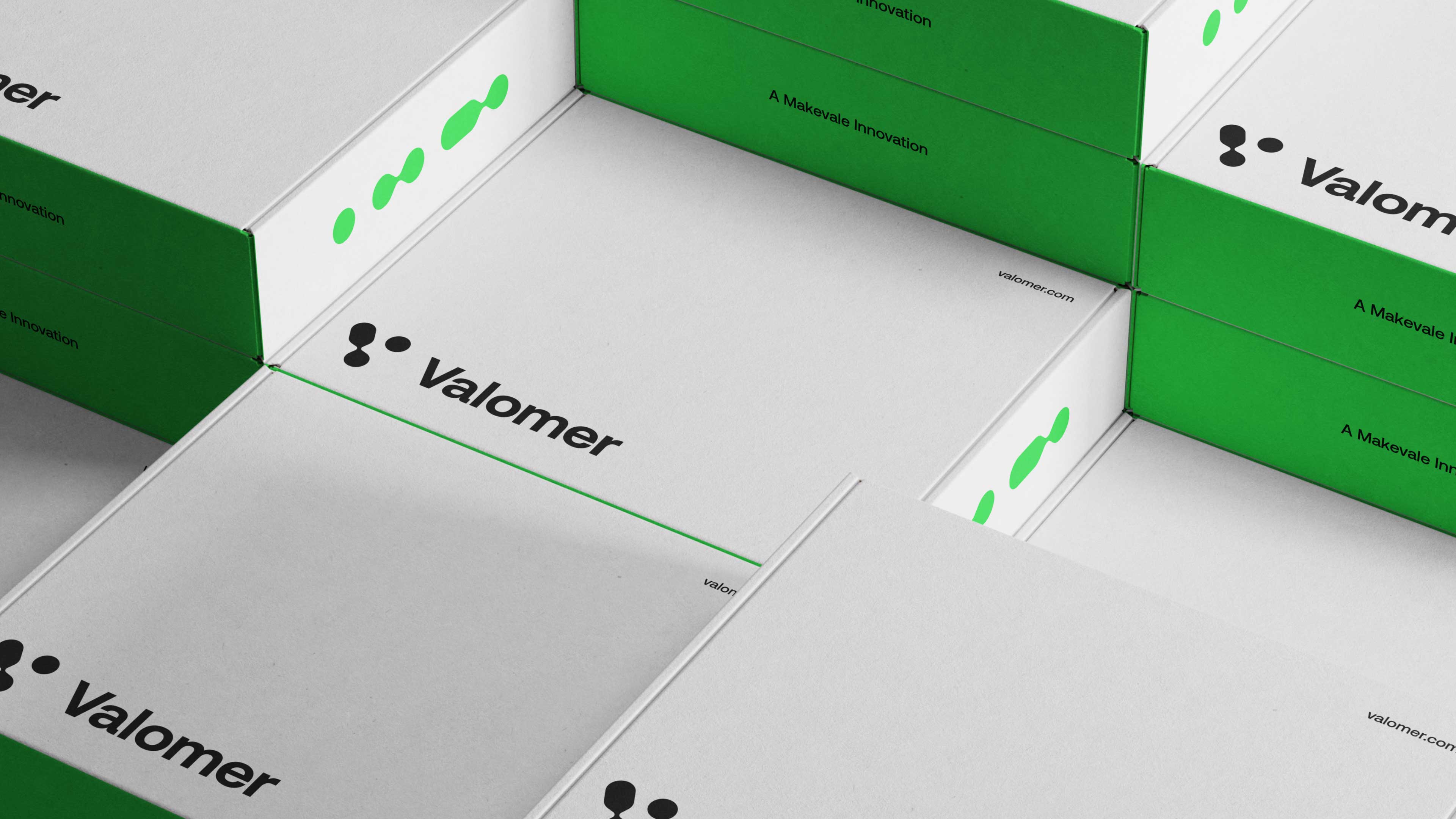
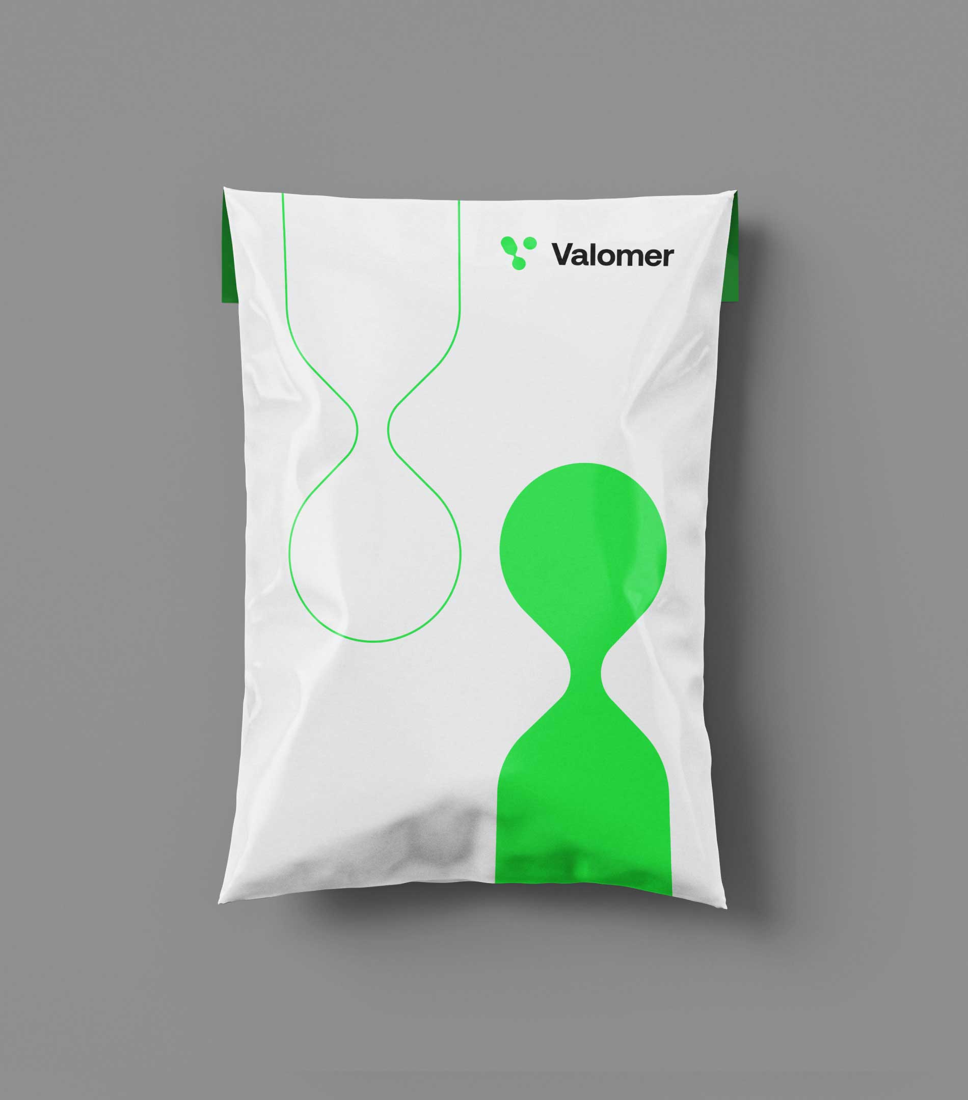
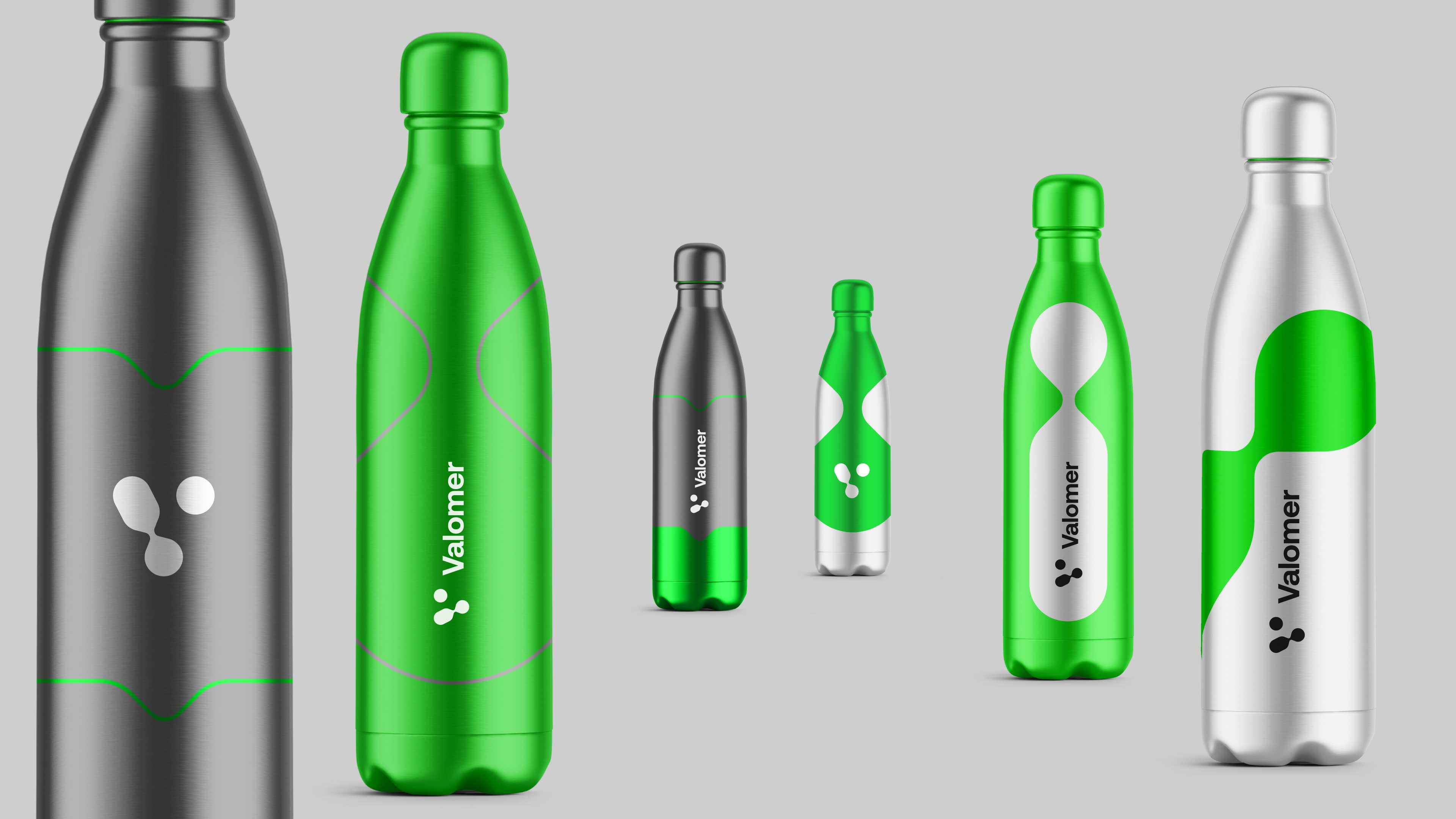
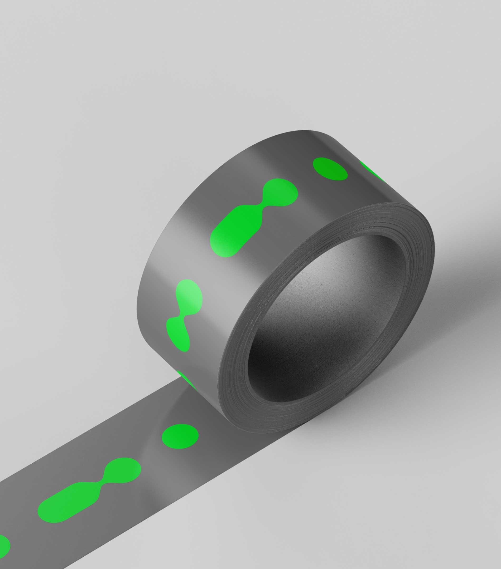
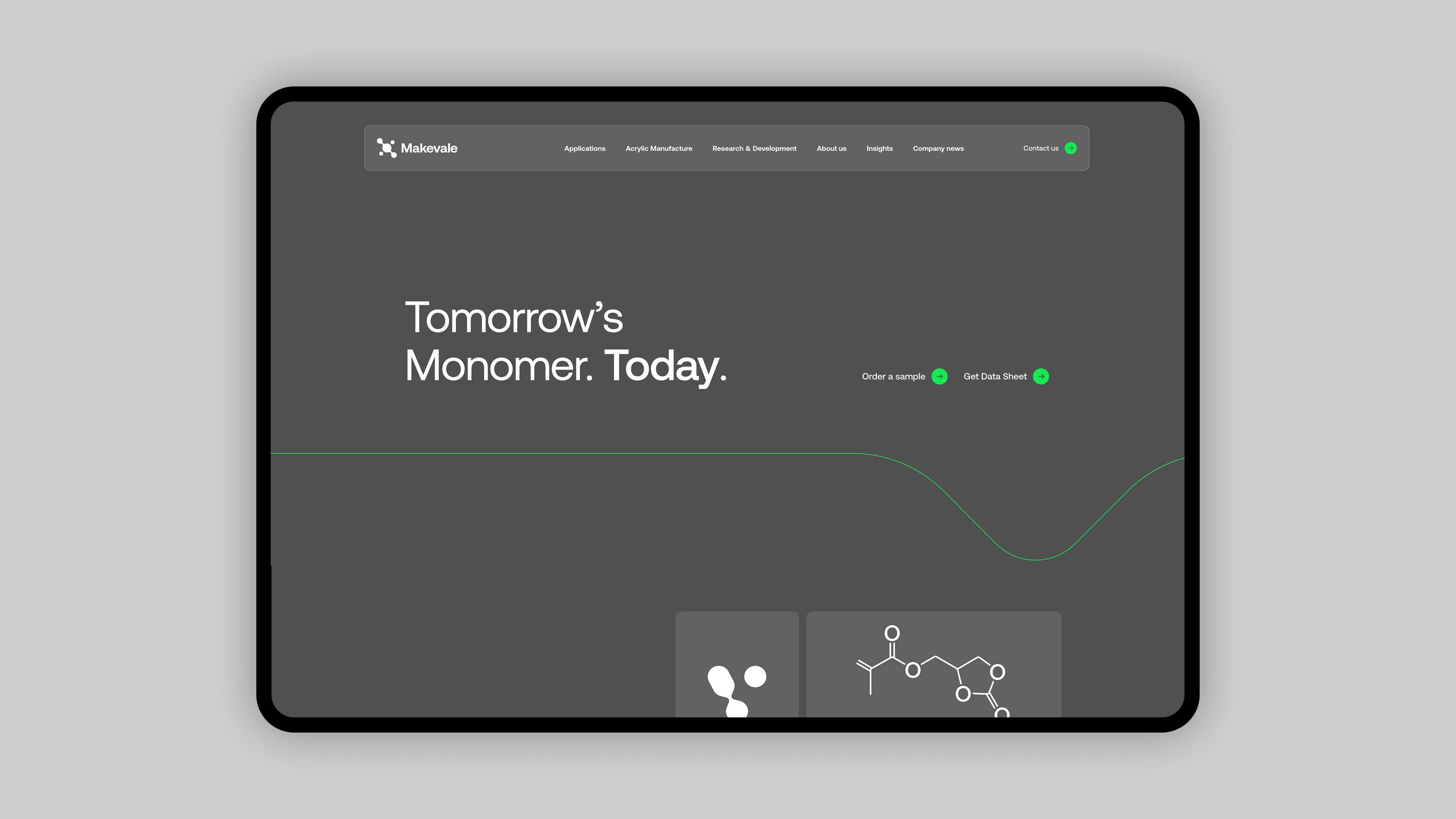
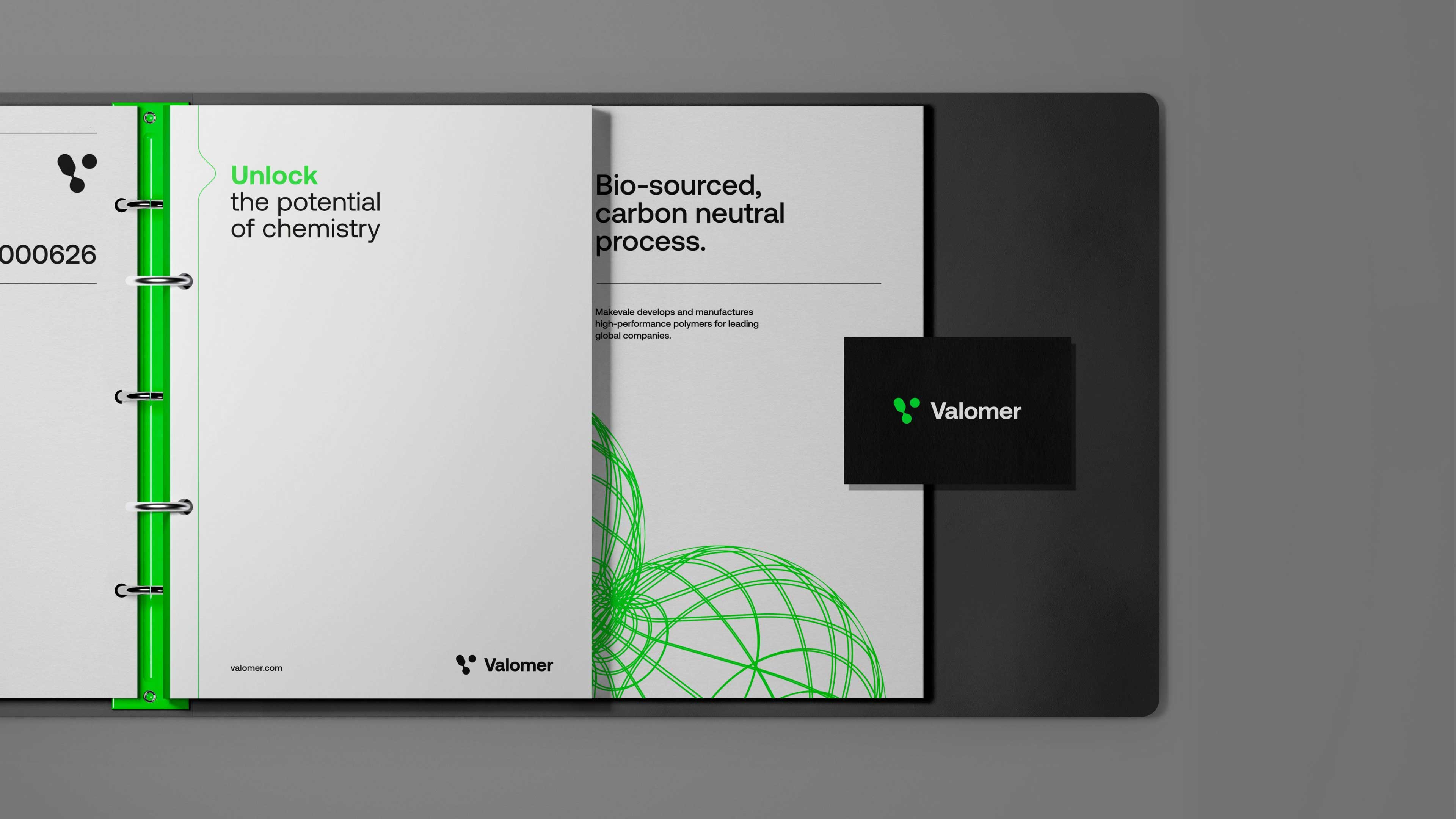
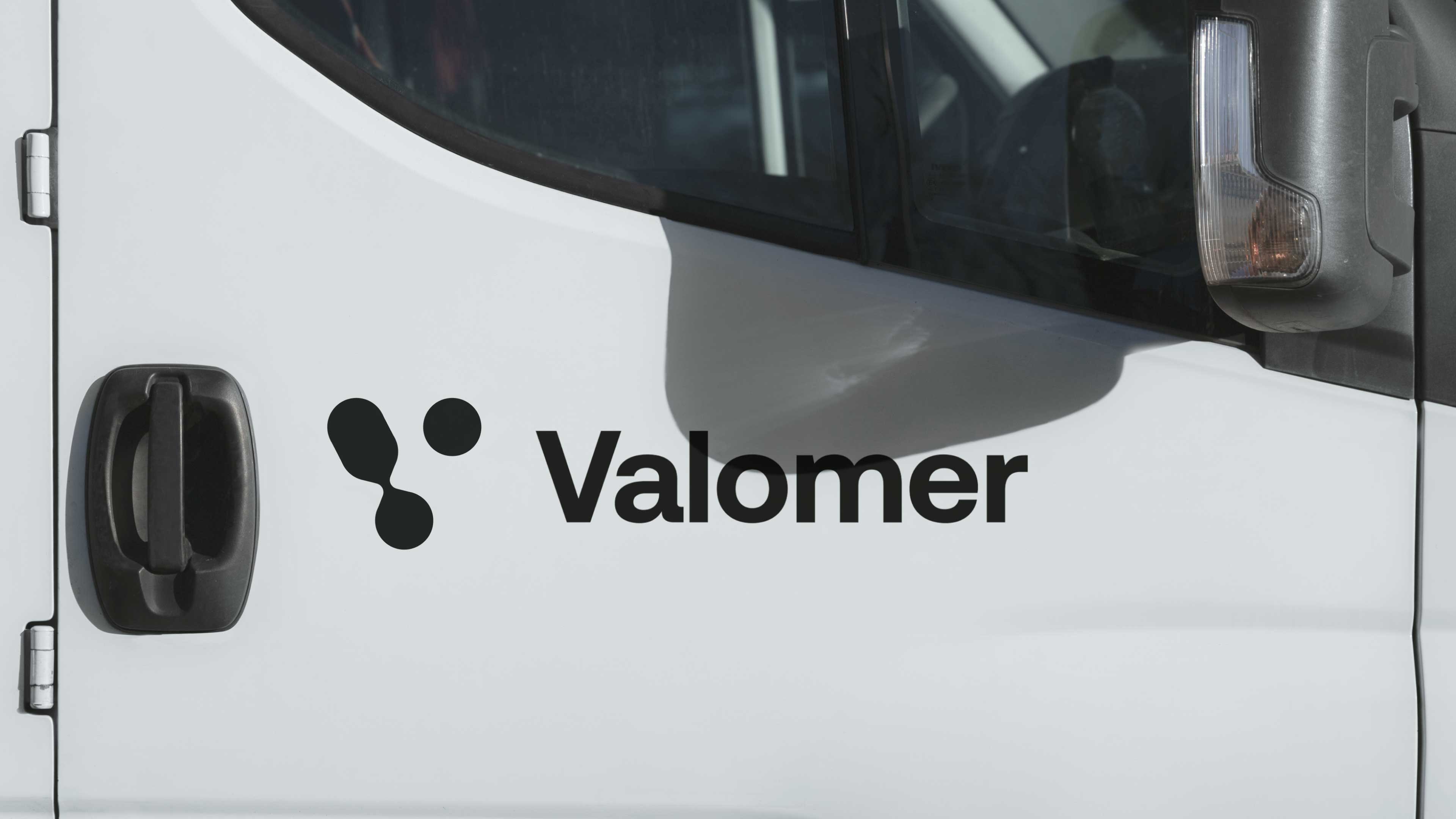
Our approach centred around brand architecture and visual continuity. Building on the foundations of the Makevale identity, we retained the core visual language while introducing a distinctive neon green as Valomer's primary brand colour. This provided immediate differentiation whilst maintaining a strong connection to the parent brand. To further strengthen the relationship, we developed an extension of the existing Makevale molecular icon. The original symbol was evolved into a new mark that subtly forms a "V", using a splitting molecule motif that reflects both the Valomer name and its relationship to the wider Makevale ecosystem.This became the first expression of a broader visual family, establishing a framework that could support future innovation programmes and sub-brands as the business continued to evolve.

Impact
A standalone platform for Makevale’s next-generation materials innovation
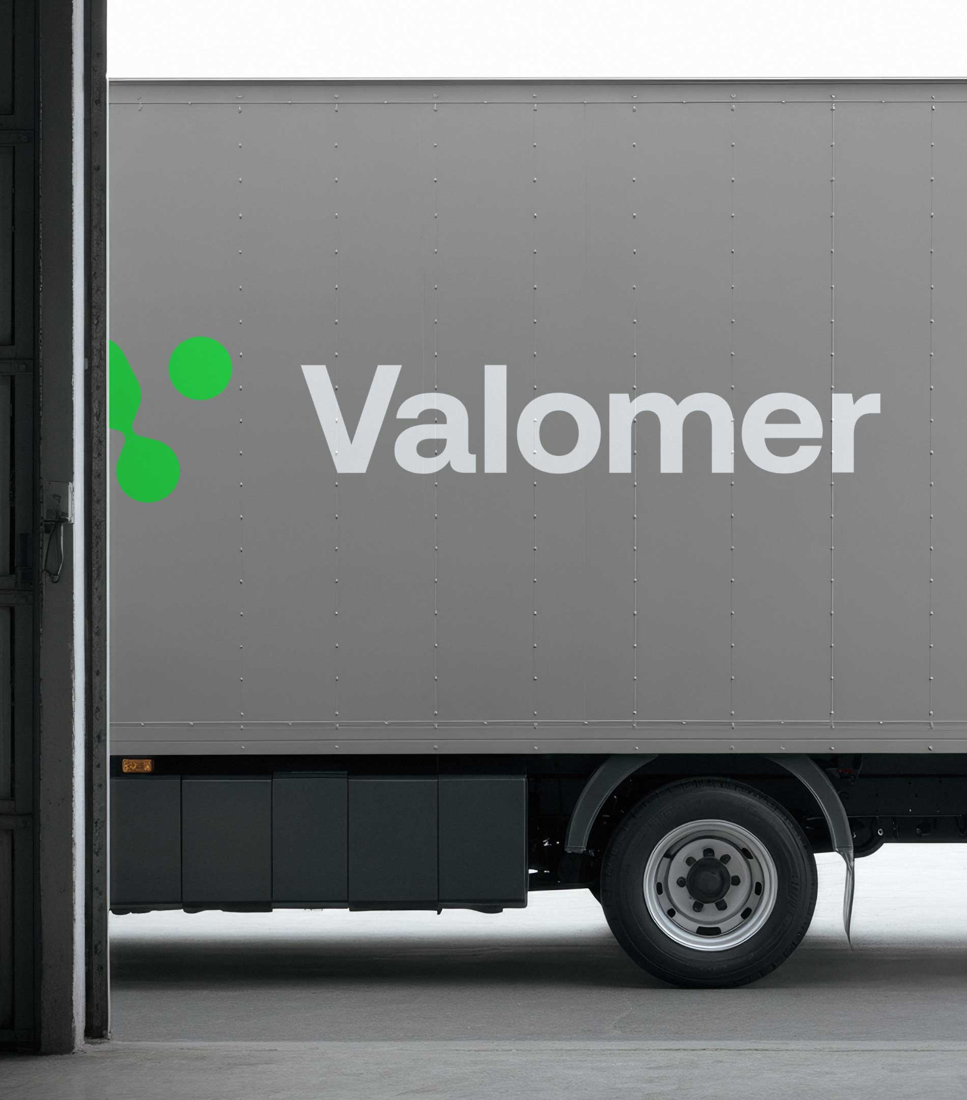
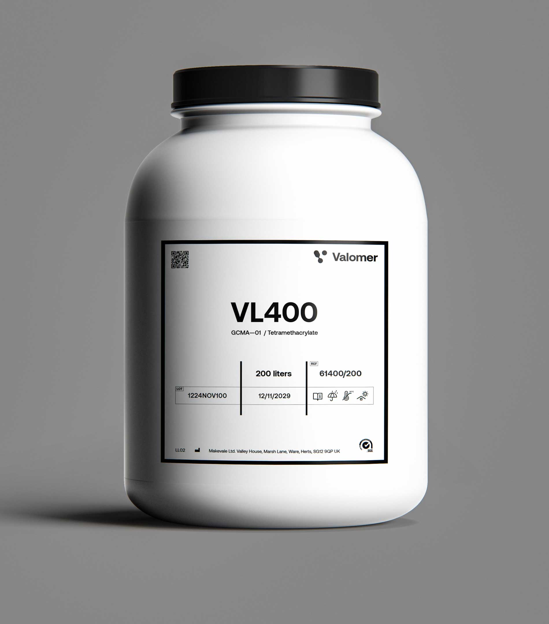
Valomer provided Makevale with a dedicated platform to communicate and promote one of its most significant innovation initiatives. By creating a brand that could stand confidently on its own while remaining connected to the masterbrand, we helped establish a clear architecture for future growth. The result was a flexible identity system designed not just for a single initiative, but as the foundation for a wider family of innovation-led brands.
For us, the project demonstrates how thoughtful brand architecture can help businesses innovate, diversify and grow, without losing the equity they've already built.

Up Next