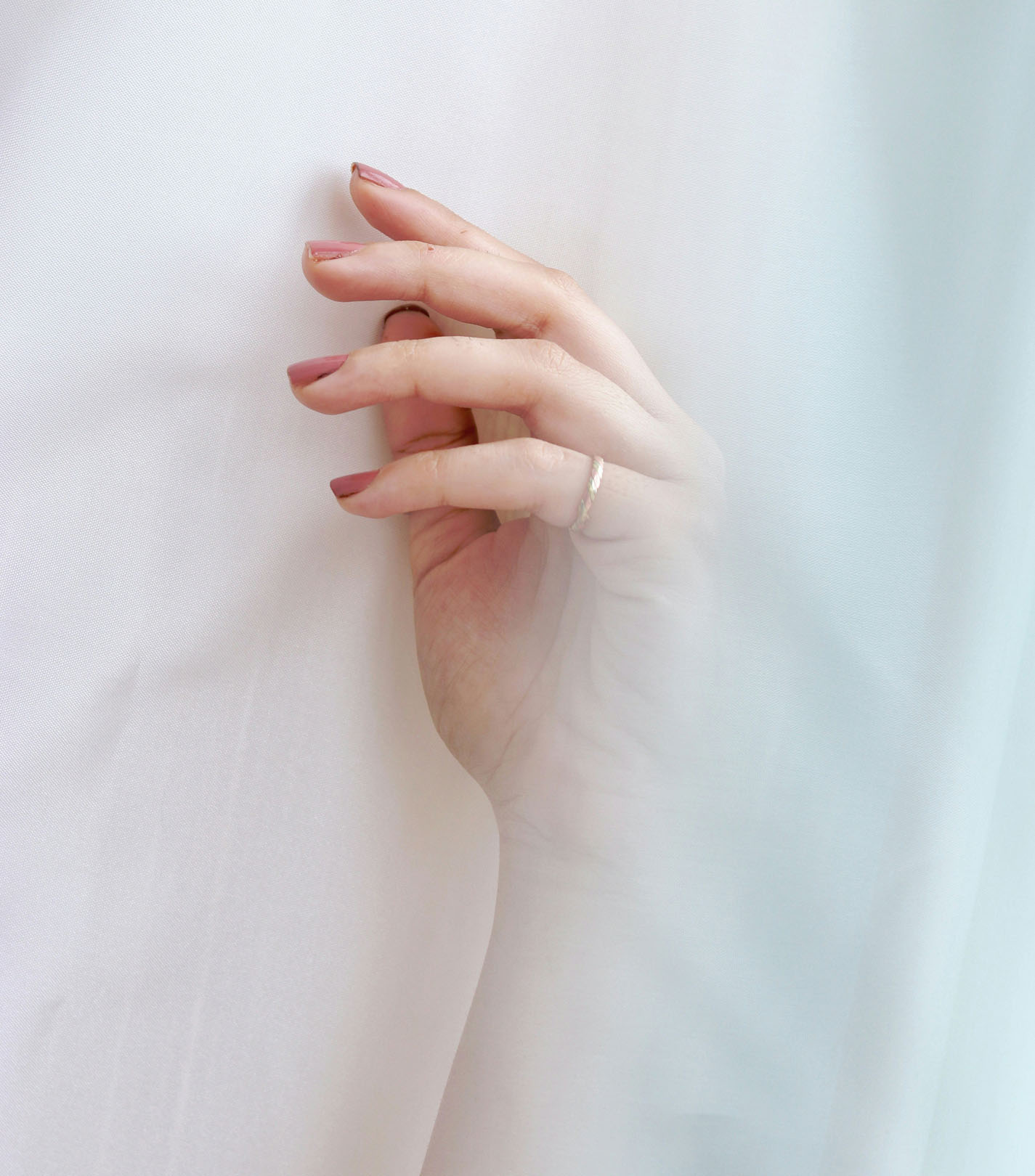
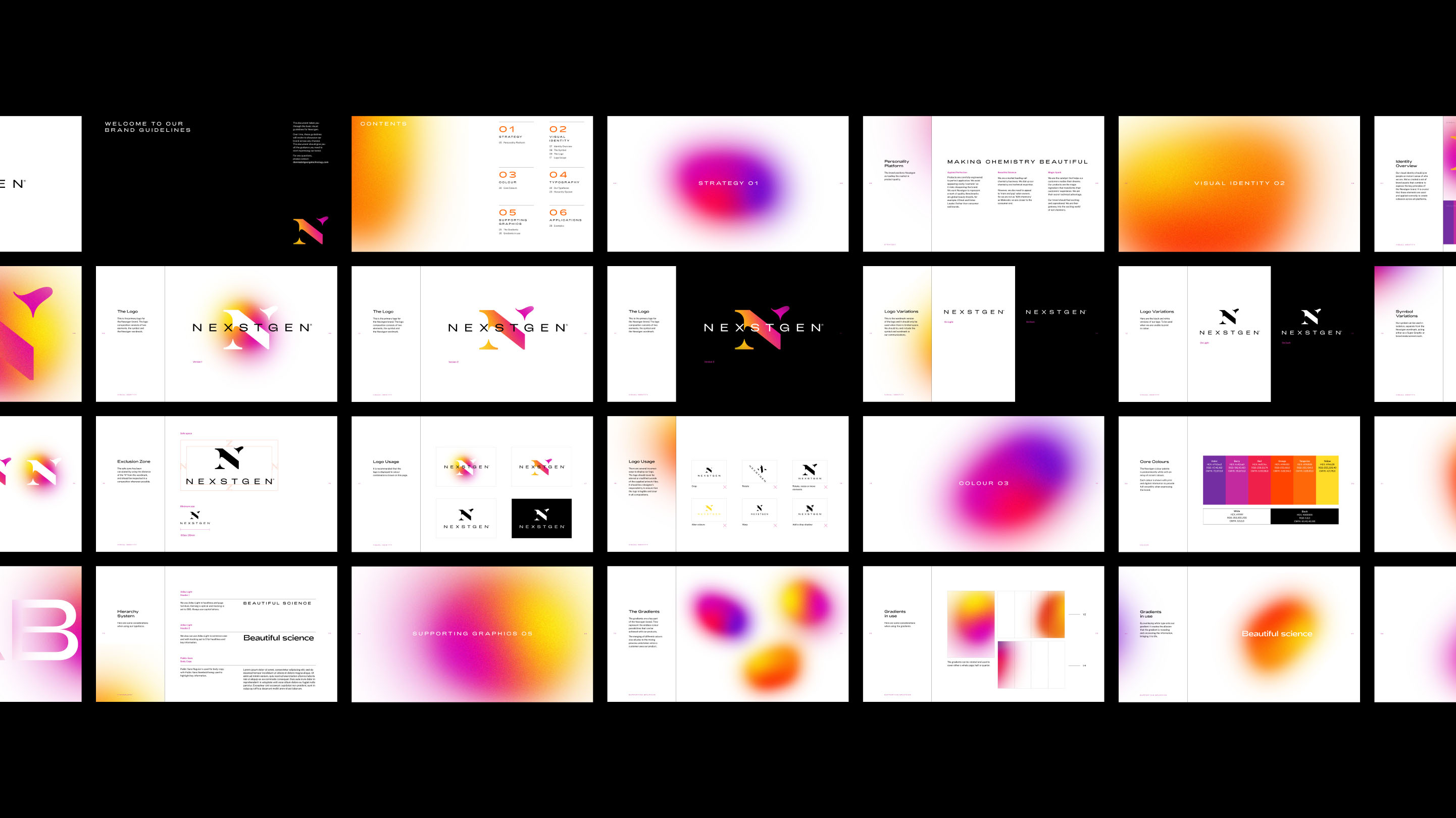
NEXSTGEN operates at the intersection of chemical precision and commercial cosmetics. They develop and supply premium acrylic powders and monomers to nail-supply distributors, private-label cosmetic brands and wholesale partners across the USA and beyond. The challenge was to build a brand identity that balances two very different worlds: the rigorous, technical ethos of a chemical manufacturer and the expressive, aesthetic sensibility of a cosmetics brand. The identity needed to speak credibly to salons, nail-tech businesses and wholesale buyers, signalling performance, safety and quality — while also feeling fresh, modern and ownable in a saturated beauty market.
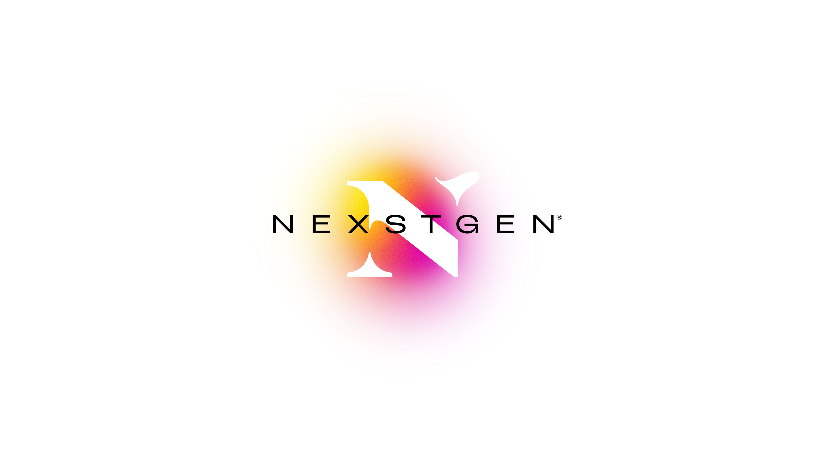
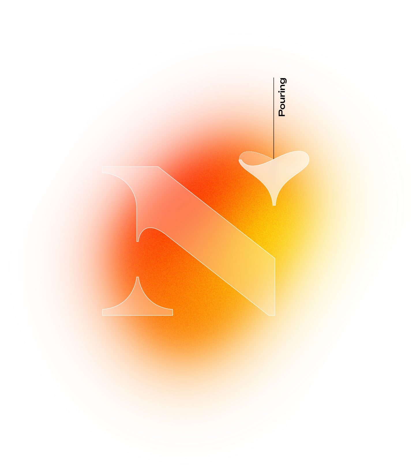
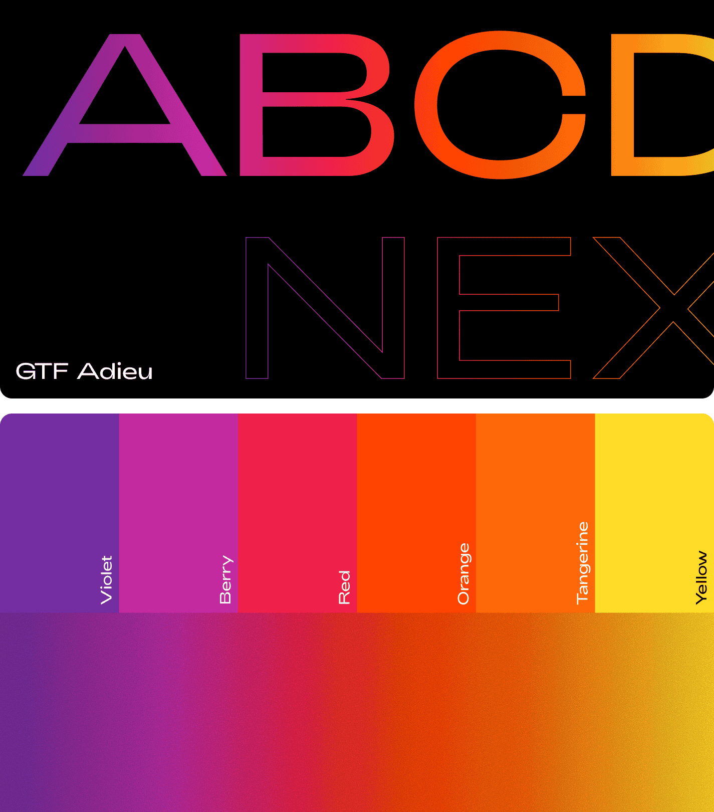
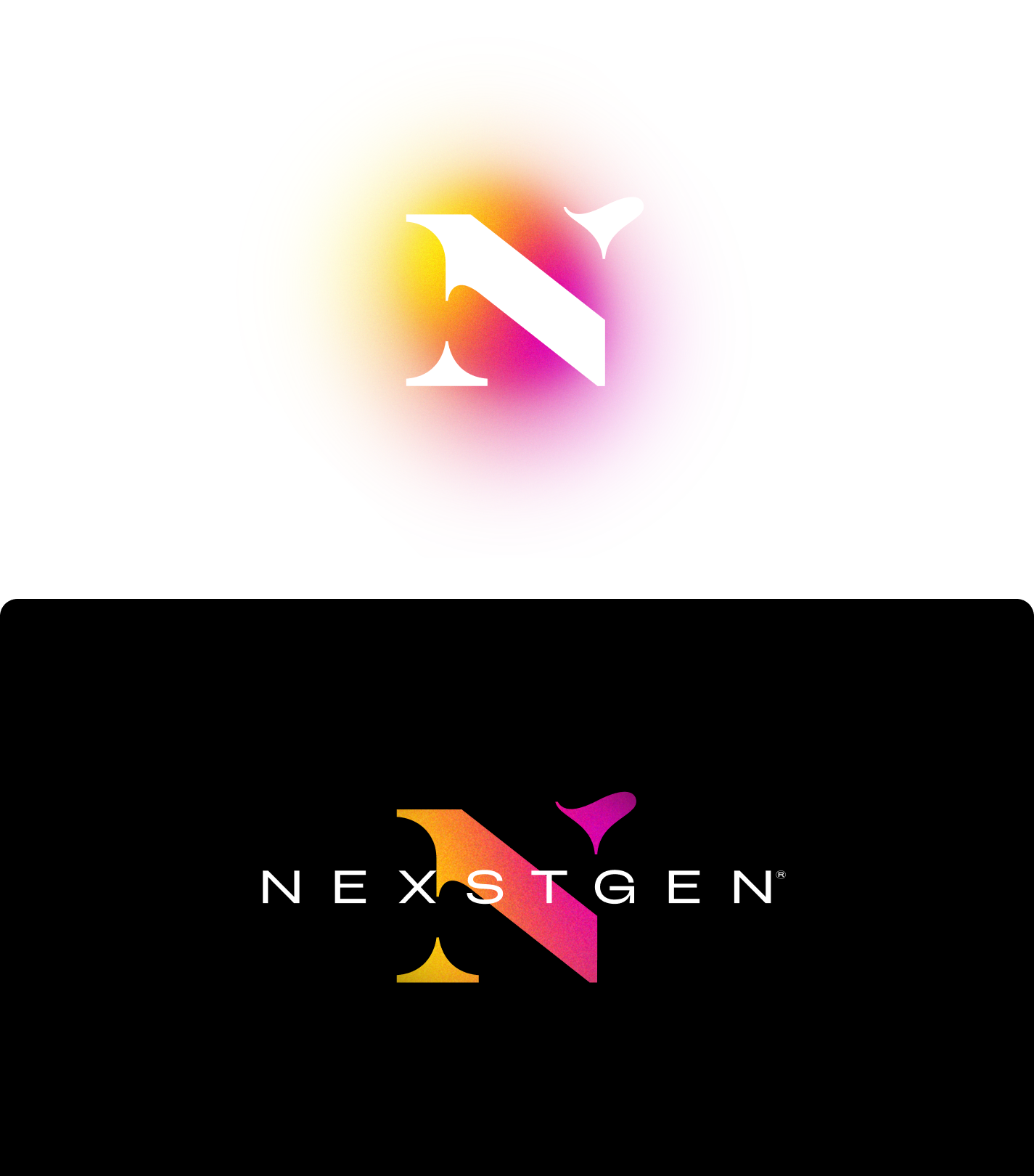
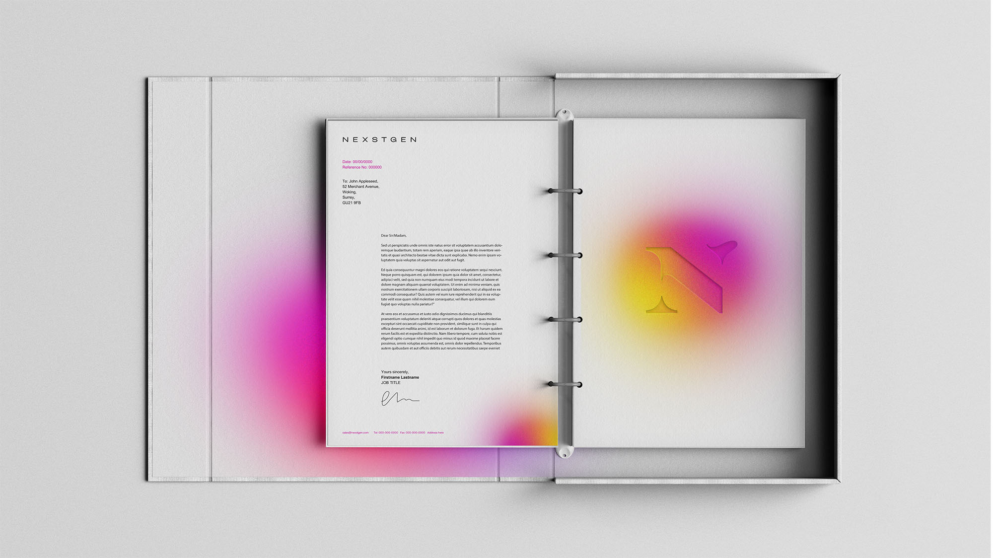
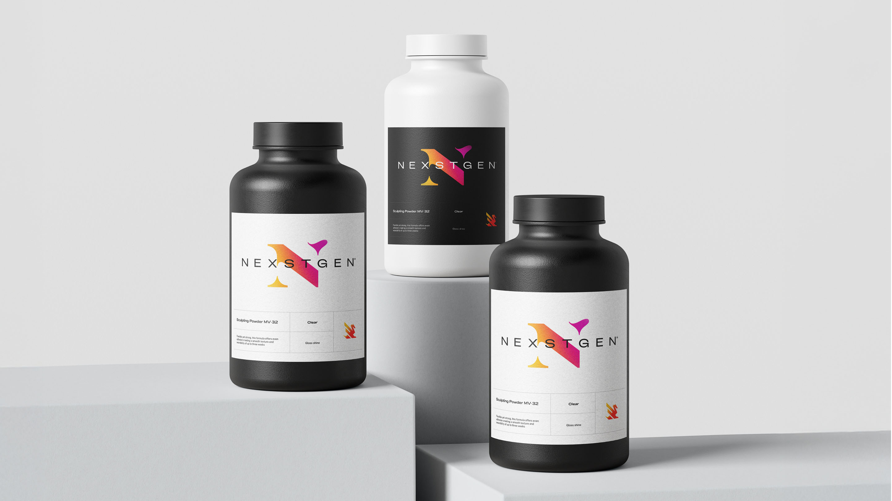
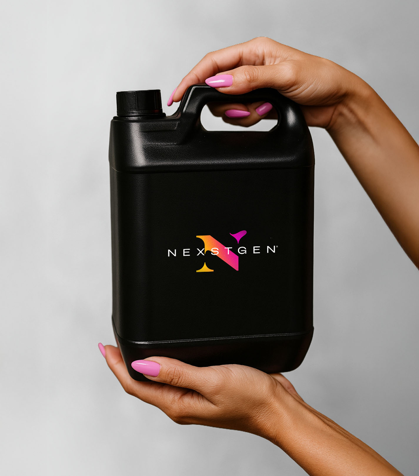
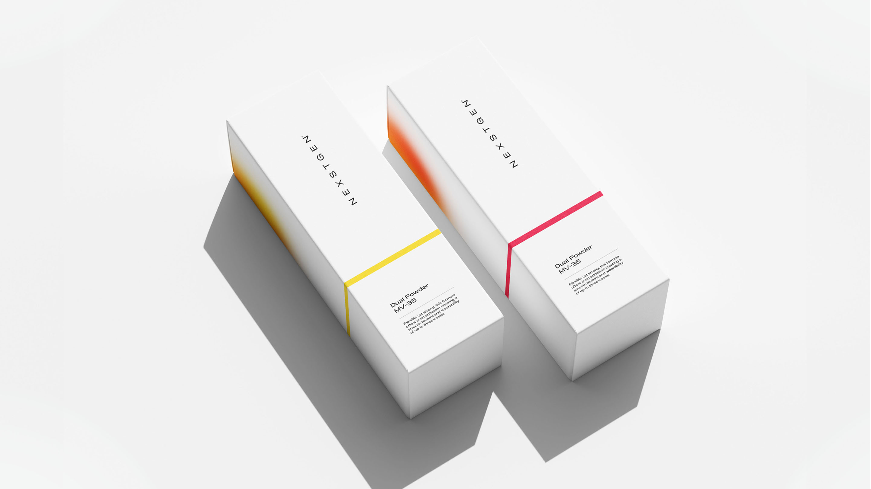
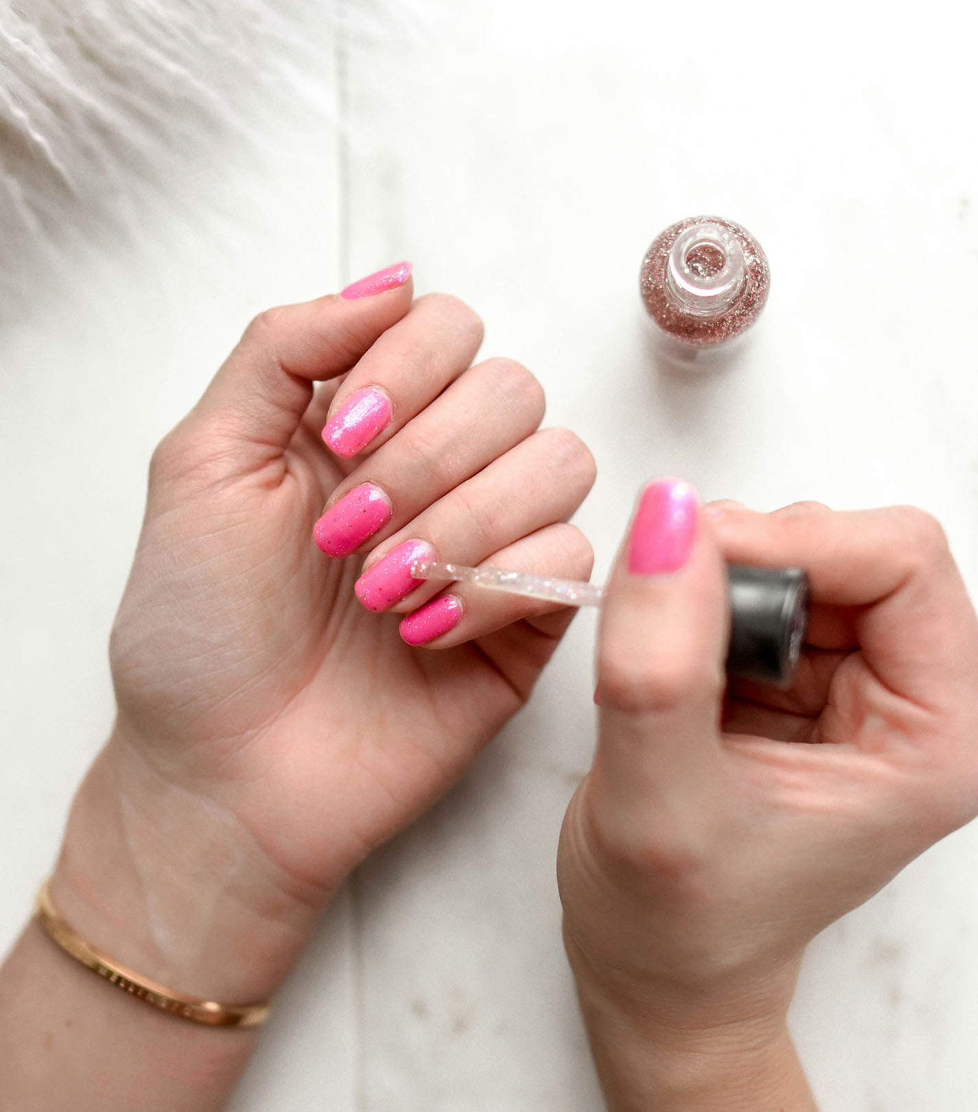
We developed a visual identity rooted in the core behaviours of the product itself: the mixing of powders, the flow of monomer liquids and the moment materials bind together to create colour, strength and finish. This translated into a bold N-monogram, crafted in a stencil form, with its ascender hinting at the liquid pour, and gradients to evoke powder dispersion, a symbolic nod to the chemistry behind NEXSTGEN’s acrylic systems. The full brand system combines clean layouts, premium typography, and a palette that can sit comfortably on packaging, digital storefronts, B2B collateral and wholesale product sheets. The result is a brand that bridges lab-grade precision and salon-style polish.
With the new identity in place, NEXSTGEN now communicates with clarity and distinction, perfectly aligned to both B2B buyers and beauty-industry audiences. The brand system helps the company show up as both scientifically credible and stylistically contemporary, giving them a strong foundation to compete in the global nail-acrylic market. Internally, the new identity gives wholesale clients confidence in product quality, while externally it supports NEXSTGEN’s positioning as “next-gen chemistry for modern nails.” As the brand continues to grow, the visual identity remains flexible and scalable, ready to support future product ranges, packaging lines, and global distribution.
Purpose / Positioning / Proposition / Brand strategy / Narrative / Brand architecture / Logo / Visual identity / Brand systems / Art direction / Motion / 3D / Packaging / Guidelines + toolkits
Lee Fairbrother
Nick Gardner
Joe Gardner
Sorby Brown
Emma Judd
Purpose / Positioning / Proposition / Brand strategy / Narrative / Brand architecture / Logo / Visual identity / Brand systems / Art direction / Motion / 3D / Packaging / Guidelines + toolkits
Lee Fairbrother
Nick Gardner
Joe Gardner
Sorby Brown
Emma Judd
NEXSTGEN operates at the intersection of chemical precision and commercial cosmetics. They develop and supply premium acrylic powders and monomers to nail-supply distributors, private-label cosmetic brands and wholesale partners across the USA and beyond. The challenge was to build a brand identity that balances two very different worlds: the rigorous, technical ethos of a chemical manufacturer and the expressive, aesthetic sensibility of a cosmetics brand. The identity needed to speak credibly to salons, nail-tech businesses and wholesale buyers, signalling performance, safety and quality — while also feeling fresh, modern and ownable in a saturated beauty market.
We developed a visual identity rooted in the core behaviours of the product itself: the mixing of powders, the flow of monomer liquids and the moment materials bind together to create colour, strength and finish. This translated into a bold N-monogram, crafted in a stencil form, with its ascender hinting at the liquid pour, and gradients to evoke powder dispersion, a symbolic nod to the chemistry behind NEXSTGEN’s acrylic systems. The full brand system combines clean layouts, premium typography, and a palette that can sit comfortably on packaging, digital storefronts, B2B collateral and wholesale product sheets. The result is a brand that bridges lab-grade precision and salon-style polish.
With the new identity in place, NEXSTGEN now communicates with clarity and distinction, perfectly aligned to both B2B buyers and beauty-industry audiences. The brand system helps the company show up as both scientifically credible and stylistically contemporary, giving them a strong foundation to compete in the global nail-acrylic market. Internally, the new identity gives wholesale clients confidence in product quality, while externally it supports NEXSTGEN’s positioning as “next-gen chemistry for modern nails.” As the brand continues to grow, the visual identity remains flexible and scalable, ready to support future product ranges, packaging lines, and global distribution.