Challenge
Making skills development easier to scale
Hive Learning is a platform built to help organisations develop skills, capability and performance through collaborative learning. As the business matured, the brand needed to better reflect the clarity, intelligence and scale of the product itself. The existing visual identity had grown complex over time, with a broad colour palette and a logo mark that lacked a clear role within the wider system. The challenge was to strip things back and create a more coherent, flexible identity that could scale across product, marketing and brand touchpoints.



Solution
Turning the brand into a flexible learning system
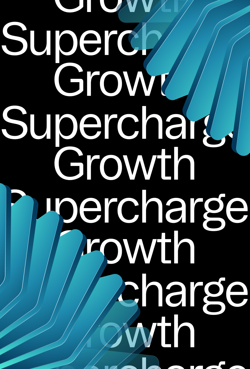
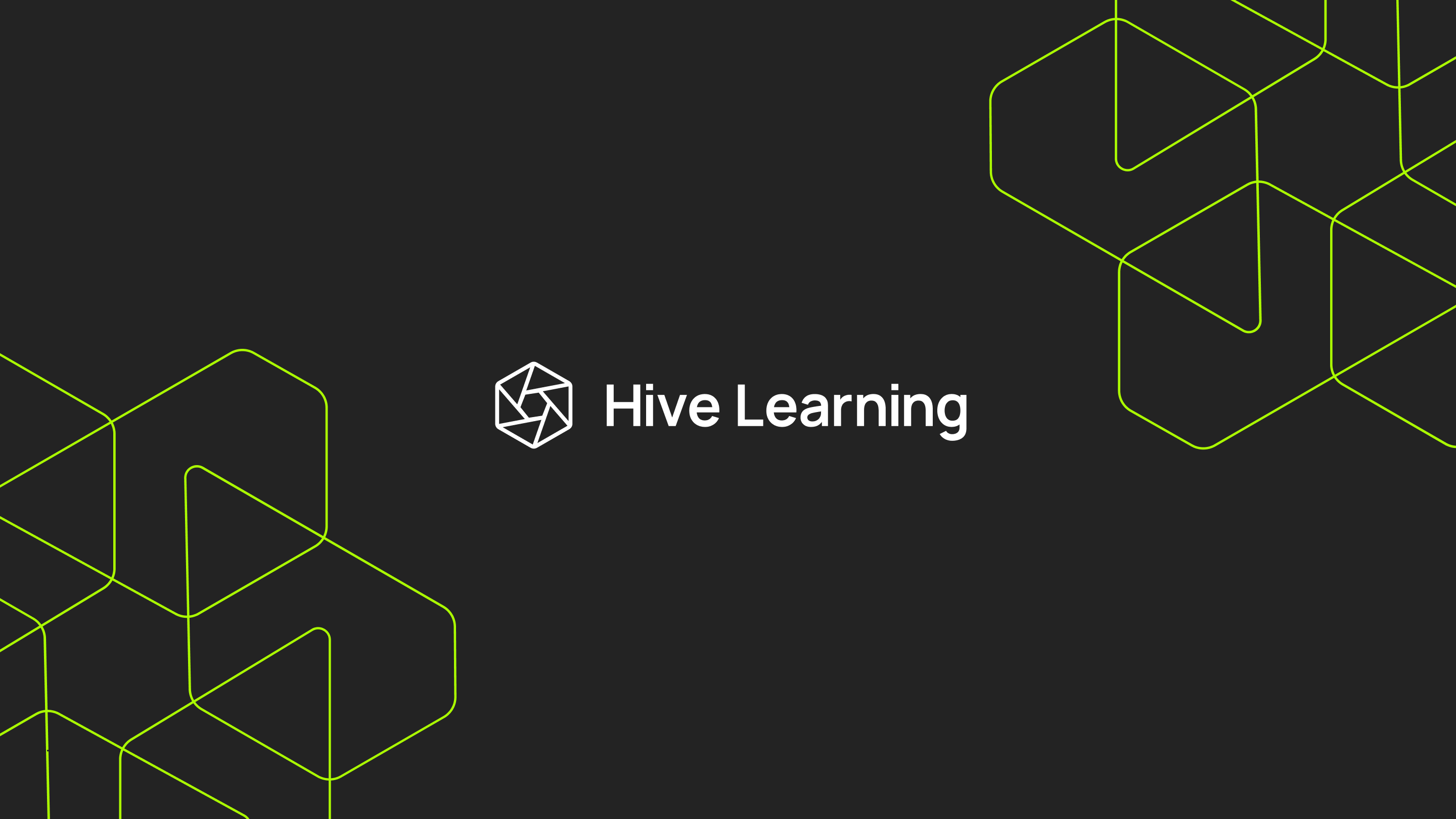
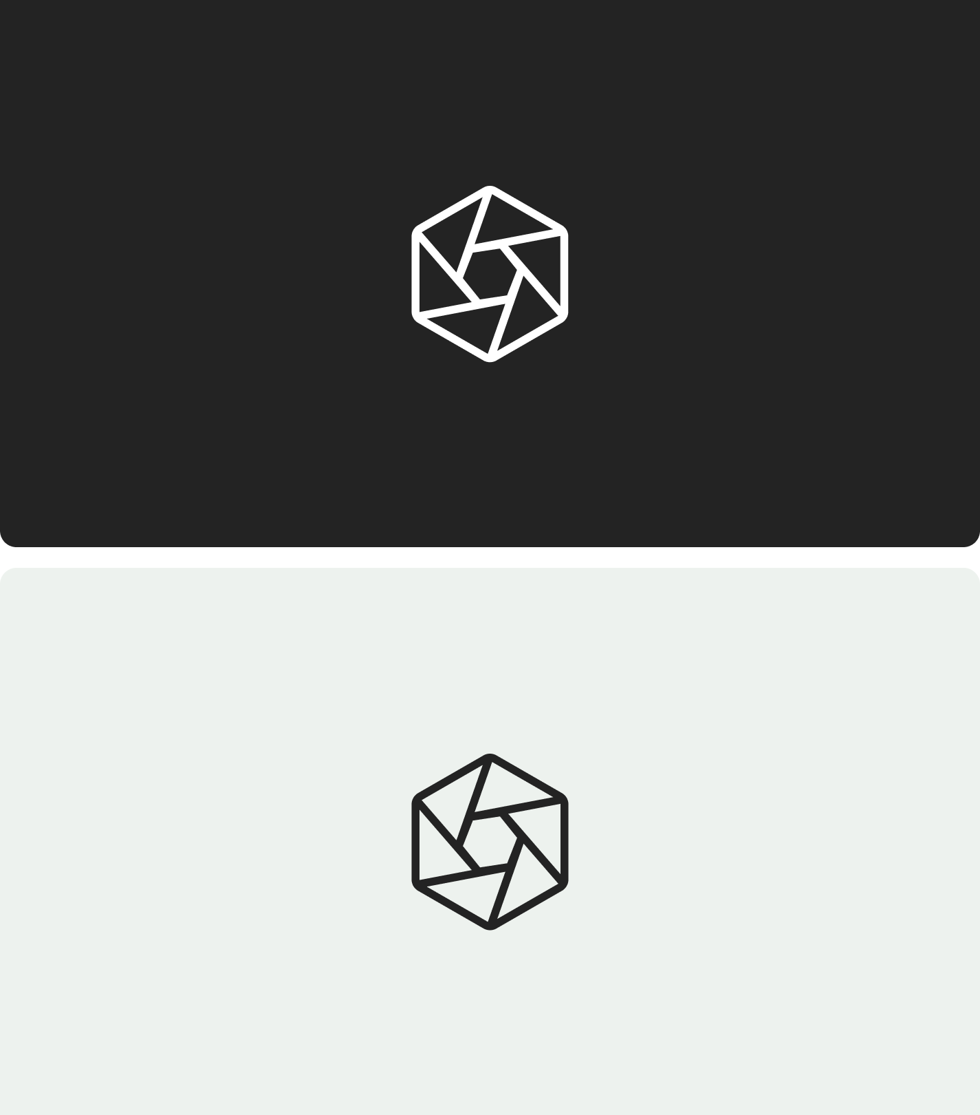
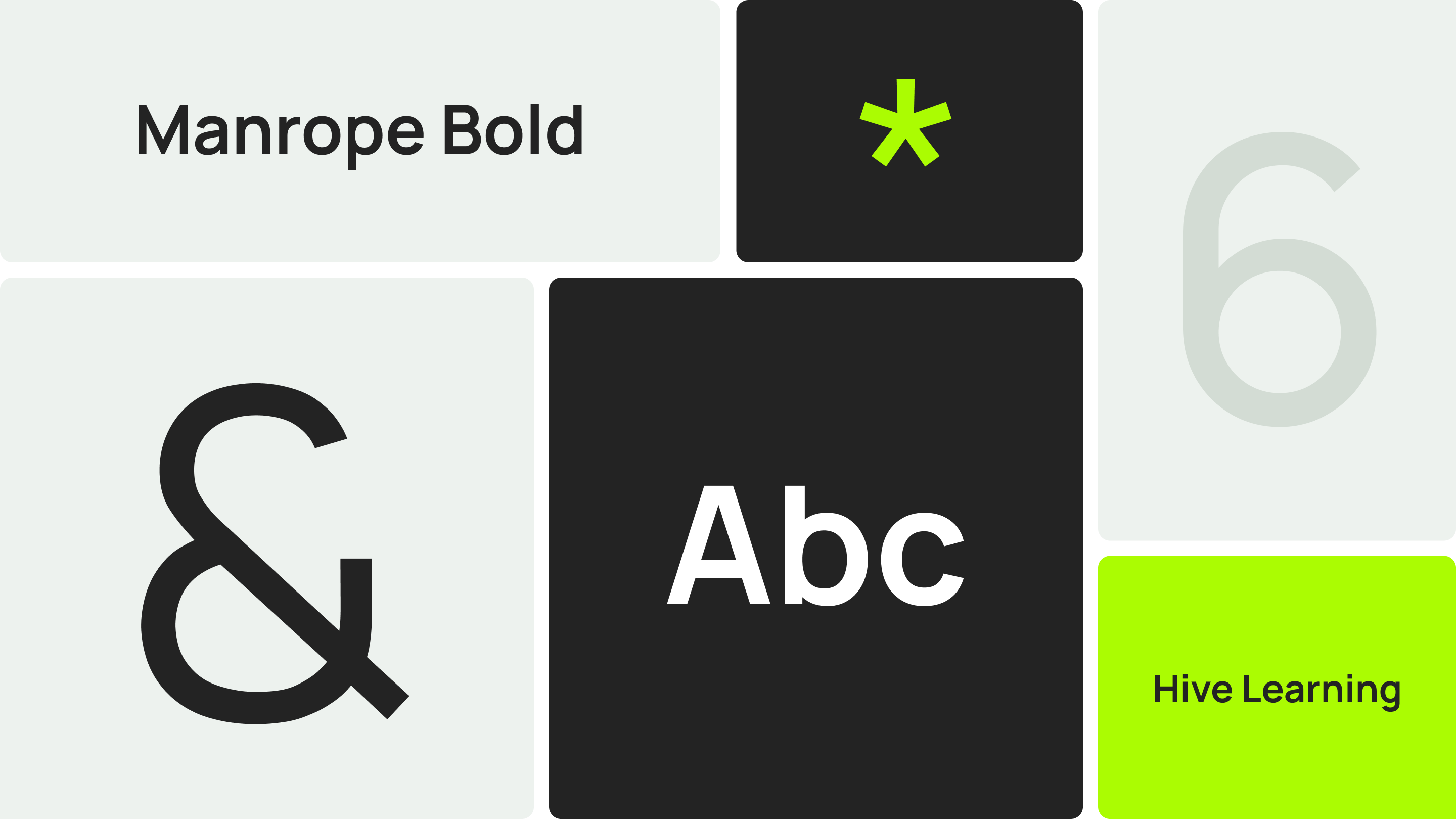
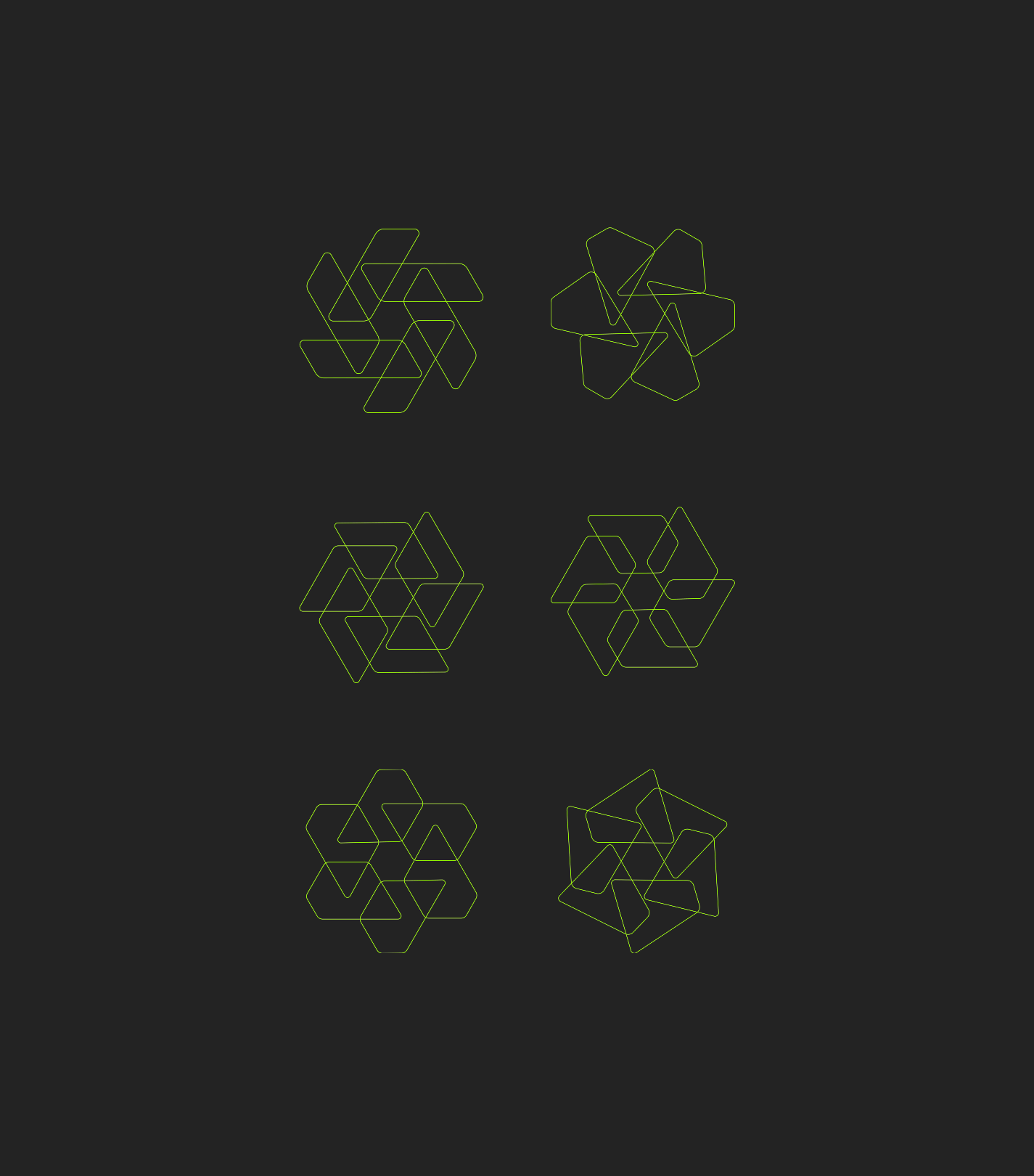
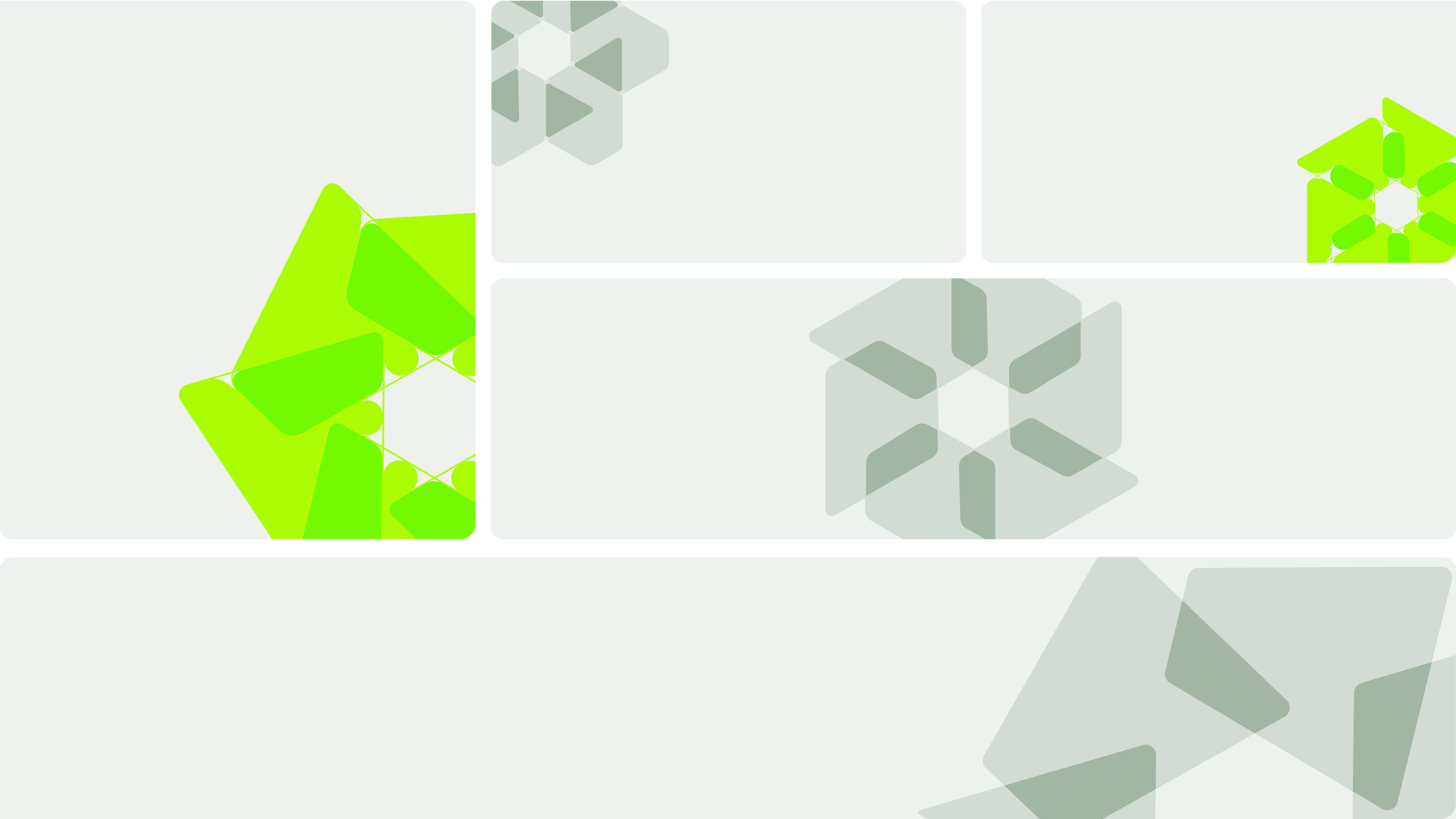
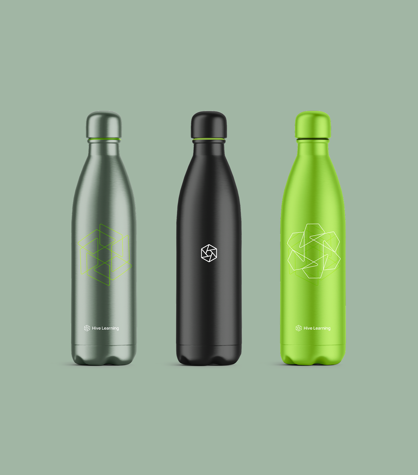
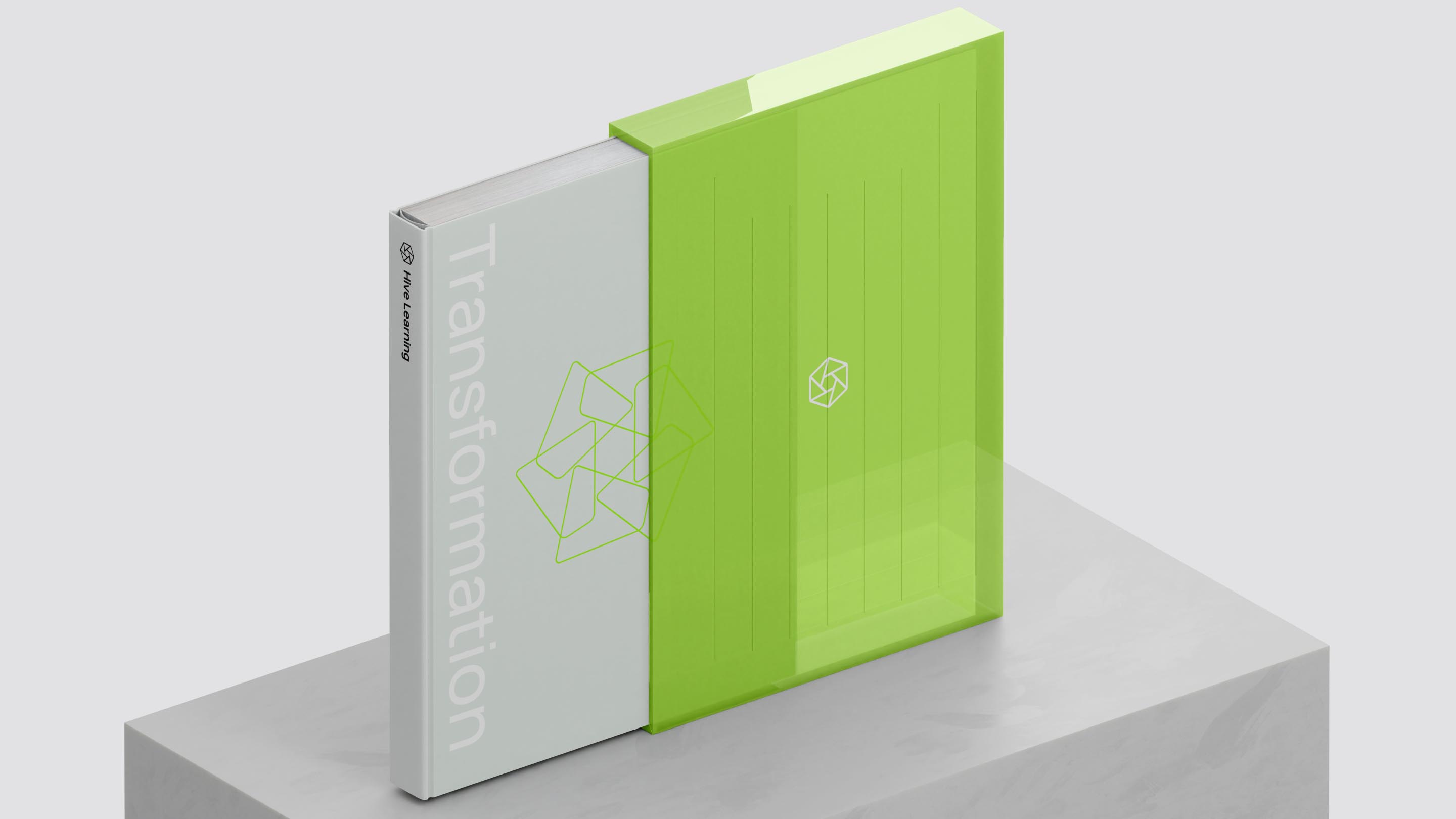
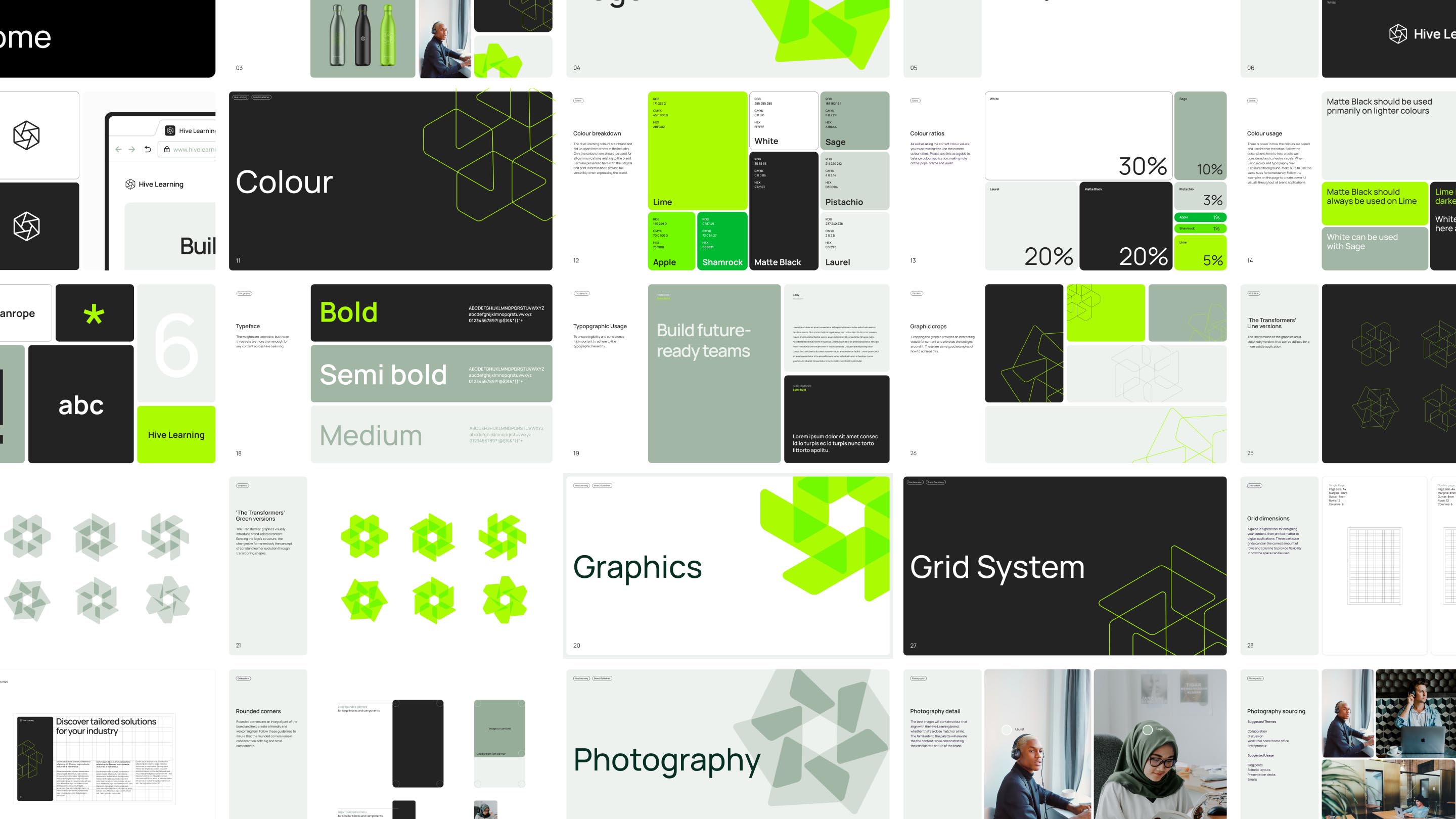
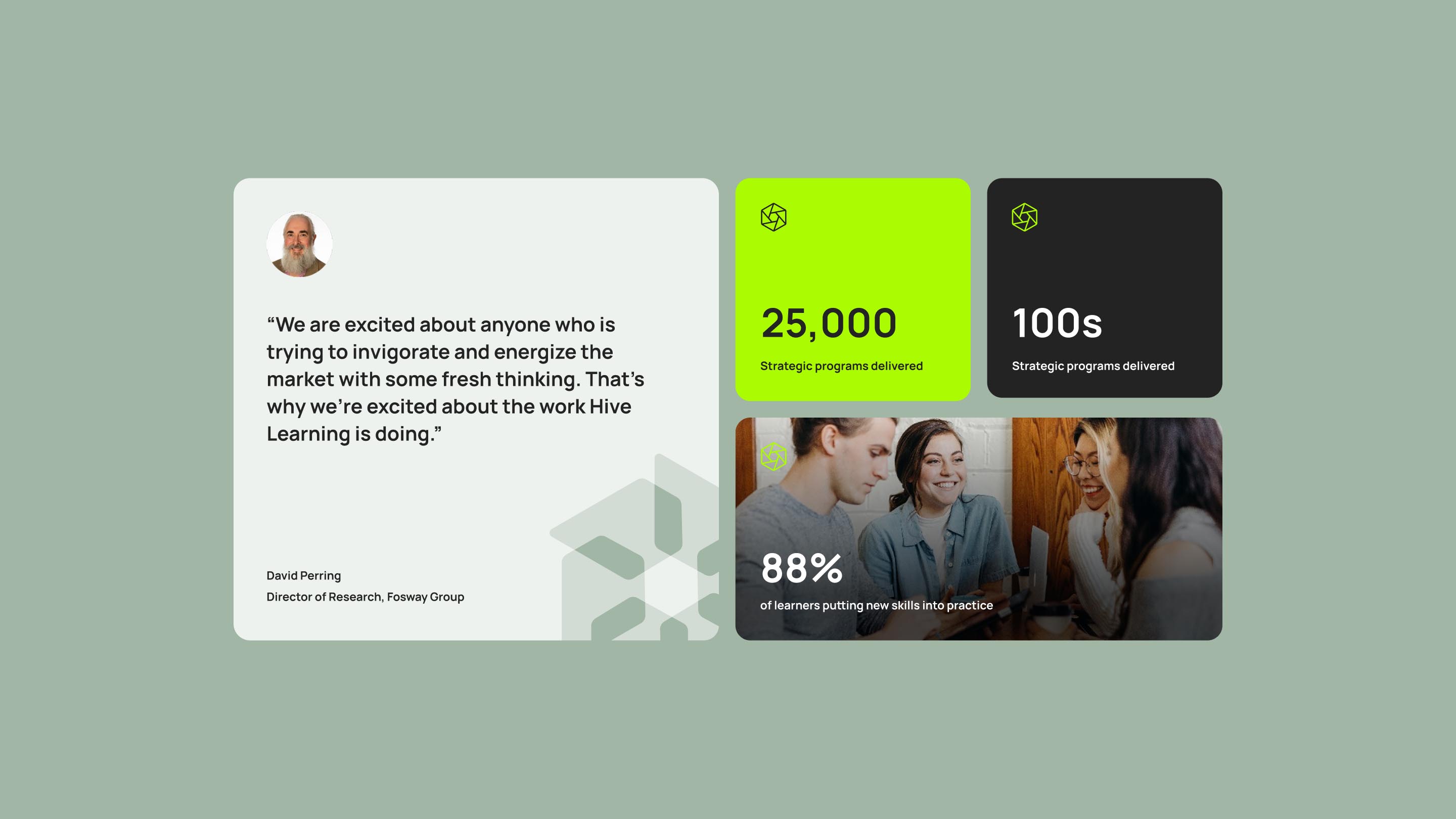
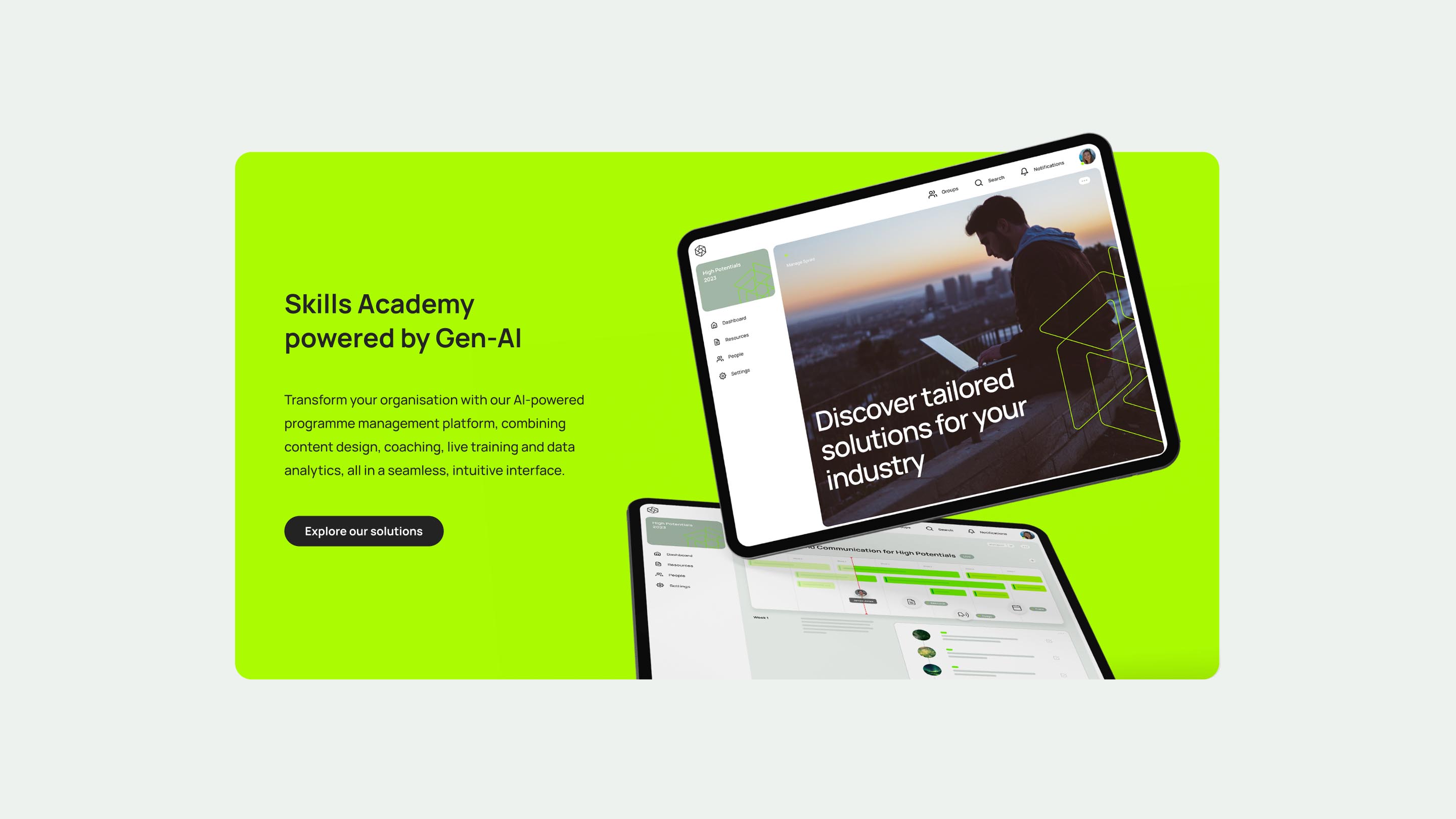
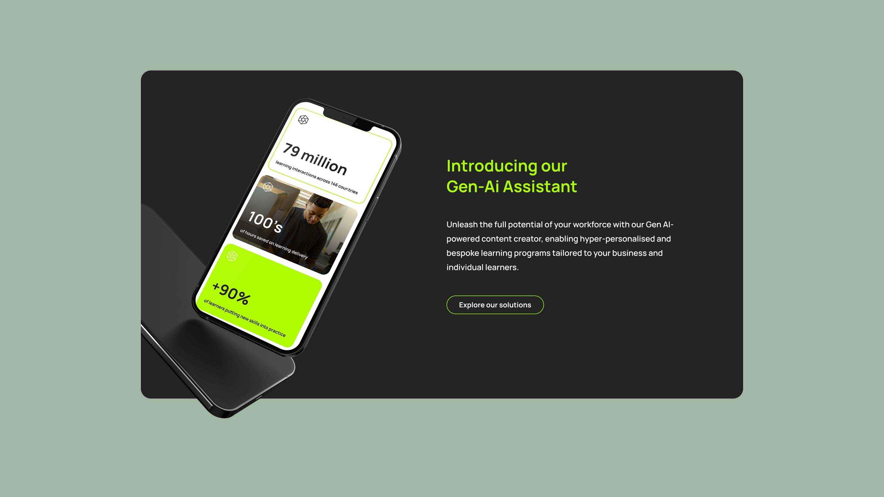
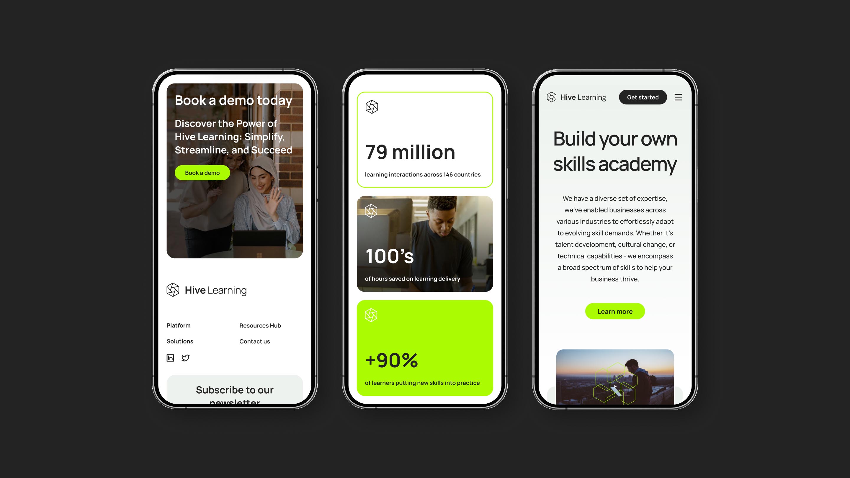
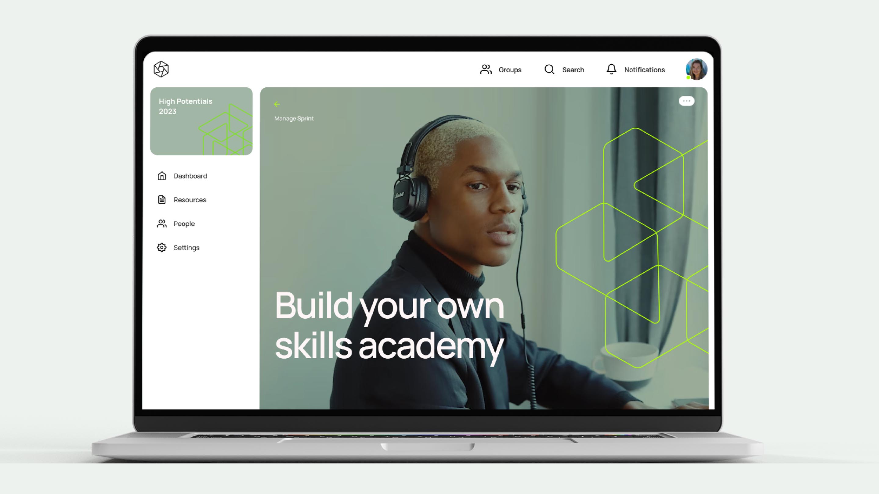
We refocused the identity around the Hive emblem, giving it new meaning and purpose. By deconstructing the mark into tessellating geometric shapes, we created a modular visual language capable of generating endless supporting graphics and patterns. This approach allowed the logo to move beyond a static symbol and become the foundation of the entire system. Alongside this, we simplified the colour palette, moving away from a technicolour mix towards a more restrained, confident set of tones that improved clarity and consistency across digital and physical applications. The result was a design system built for flexibility, structure and long-term use.

Impact
A scalable brand for the next era of workplace learning
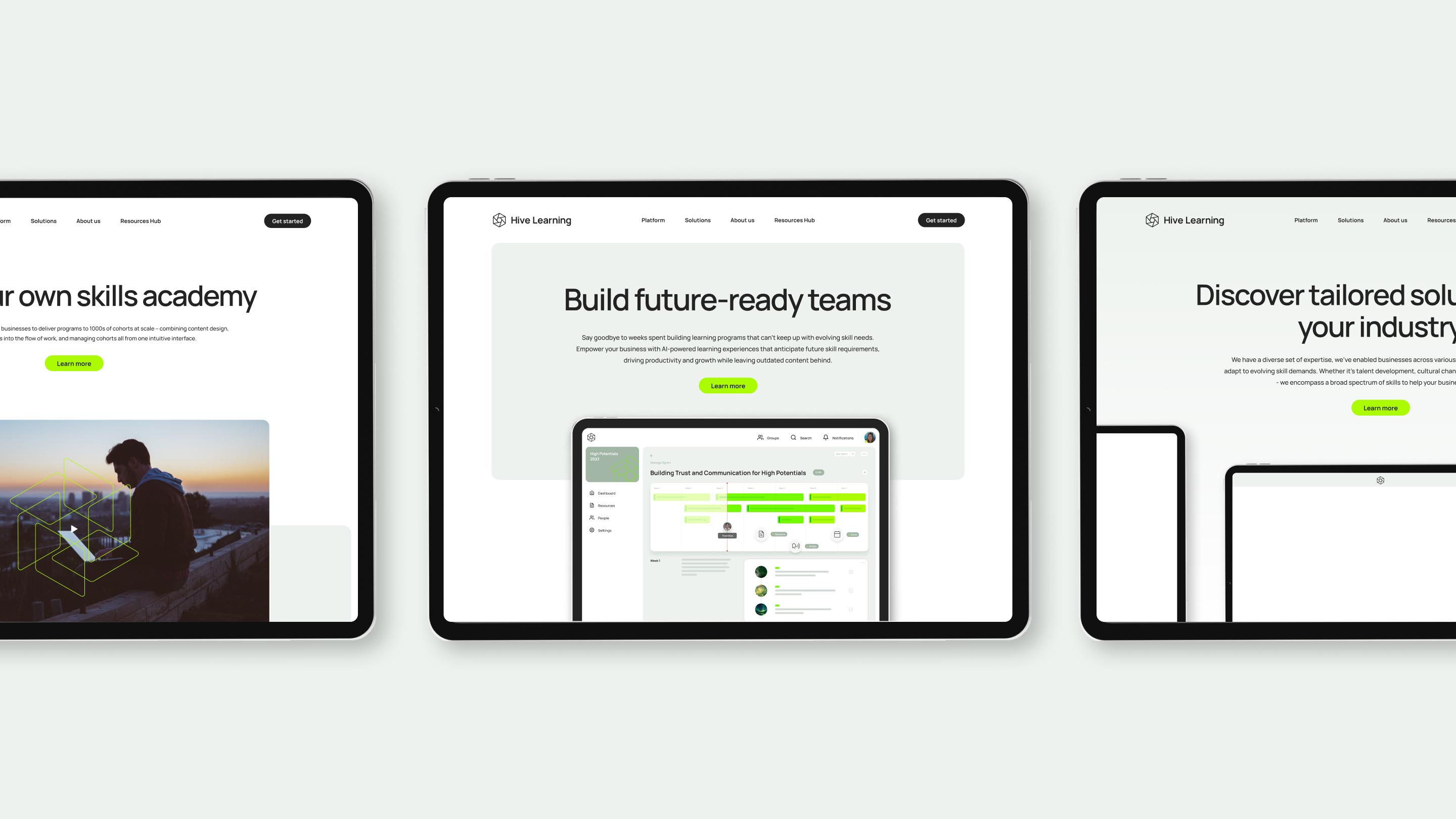
The refreshed identity gave Hive Learning a clearer, more confident presence across its platform and communications. By anchoring the brand in a single, scalable visual idea, the system became easier to apply, easier to evolve and more recognisable at scale. The work helped align Hive’s visual language with the sophistication of its learning product, creating a brand that feels focused, modern and built to support future growth.
Up Next