Hazy was delivering a game-changing capability: the ability to create synthetic data that retains value for analytics but removes privacy risk. The challenge was to articulate this story clearly and create a brand that captures the sophistication and human impact of synthetic data, without entering the usual “AI start-up” aesthetic trap.
We worked from the inside out, building a complete brand strategy that defined Hazy’s purpose, positioning, personality and proposition. From this foundation, we created a visual and verbal identity that moves at the speed of data. The core design language is driven by flow and transformation: a continuous data wave that symbolises safe, scalable transfer. The palette, typography and motion system balance technical precision with clarity and warmth. Together, they bring focus and energy to every touchpoint, from the website to investor and partner communications.
Hazy’s renewed brand has become a benchmark in the synthetic data space, helping the company expand its partnerships and reinforce its reputation for innovation. In 2024, their technology was acquired by SAS, marking a major step in advancing enterprise-grade AI through privacy-safe data. The brand now stands as a clear expression of what synthetic data can make possible: secure, intelligent and built for progress.
Purpose / Positioning / Proposition / Brand strategy / Narrative / Tone of voice / Visual identity / Brand systems / Motion / 3D / Digital design / UI/UX design / Brand activation / Guidelines + toolkits
Lee Fairbrother
Ale Mariotti
Mihai Halmi-Nistor
Nick Gardner
Joe Gardner
Emma Judd
Hannah Gander
Abby Nicholl
Flora Williams
Purpose / Positioning / Naming / Brand strategy / Proposition / Tone of voice / Narrative / Logo / Visual identity / Brand systems / Art direction / Illustration / Digital design / UI/UX design / Brand activation / Guidelines + toolkits
Lee Fairbrother
Nick Gardner
Joe Gardner
Emma Judd
Sorby Brown
Mihai Halmi-Nistor
Hannah Gander
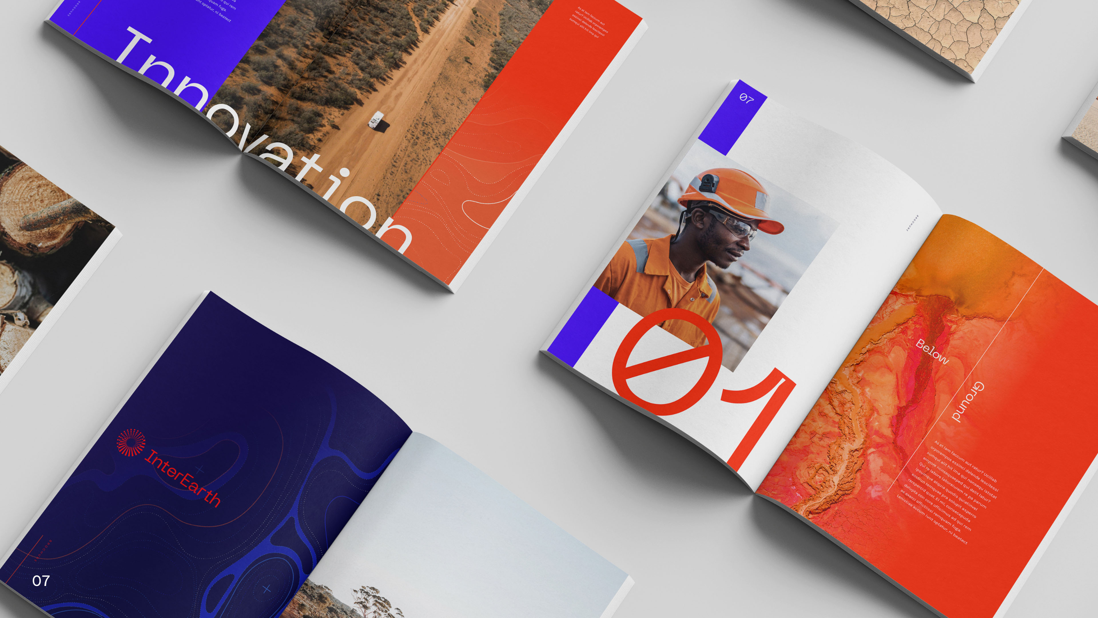
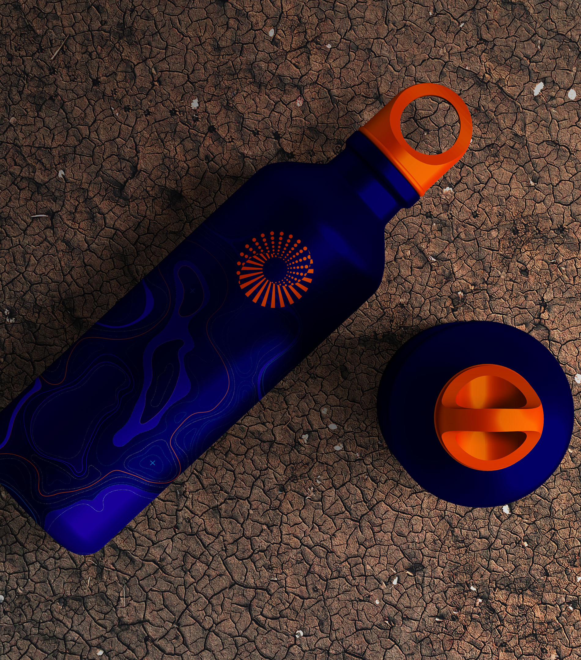
InterEarth tackles a highly technical challenge: how to remove excess atmospheric CO₂ in a way that is scalable, durable and measurable. Their process uses low-rainfall farmland, native trees and continuous harvest, but none of this was clearly communicated in their existing brand. They needed a name, a story and a visual identity that could make a complex climate solution feel grounded, action-oriented and credible.
We began with strategy, naming and tone of voice, landing on InterEarth. The name links the process to the planet and underscores “intervening in Earth systems”. Visually the identity draws from dryland Australian landscapes: the red earth, bright skies and rugged terrain where the process unfolds. We developed brand assets that reference the cycle of growth, harvest and secure storage: imagery of trees, log cross-sections, vaults and terrain textures. The tone emphasises “safe, simple, scalable, now” to mirror InterEarth’s positioning. We ensured the identity works in digital, investor decks, project signage and carbon-credit communication.
With the new brand message out, InterEarth gained clarity and credibility. They secured a multimillion-dollar deal with Germany’s SEFE to advance their CDR technology. Their model is gaining traction and the brand now supports outreach to partners, landowners and corporate buyers of CO₂ removal. The result is a stronger foundation for growth in a challenging climate-tech category.